Ergomotion Plus's Redesign Journey

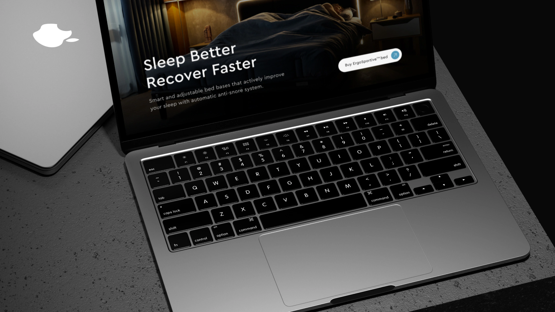
The Ergomotion Plus website on a laptop
Ergomotion Plus approached us with a challenge: enhance the user experience on their product page to boost conversions. Our task was two-fold: revamp the UX for a smoother journey and develop a strategy aligned with Ergomotion Plus's goals and audience preferences. We delved into user needs, market trends, and crafted a more intuitive and engaging design to drive users toward purchasing their beds.
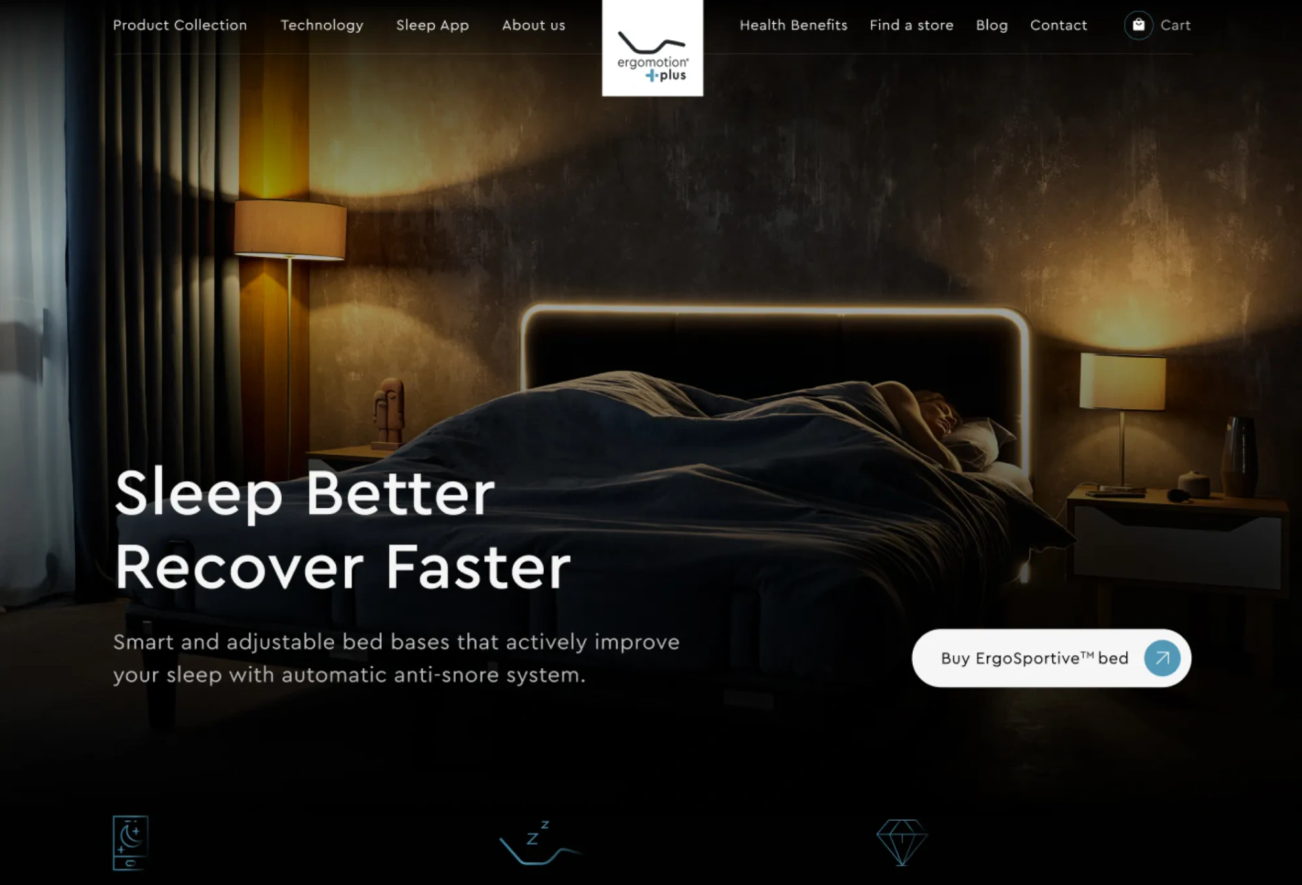
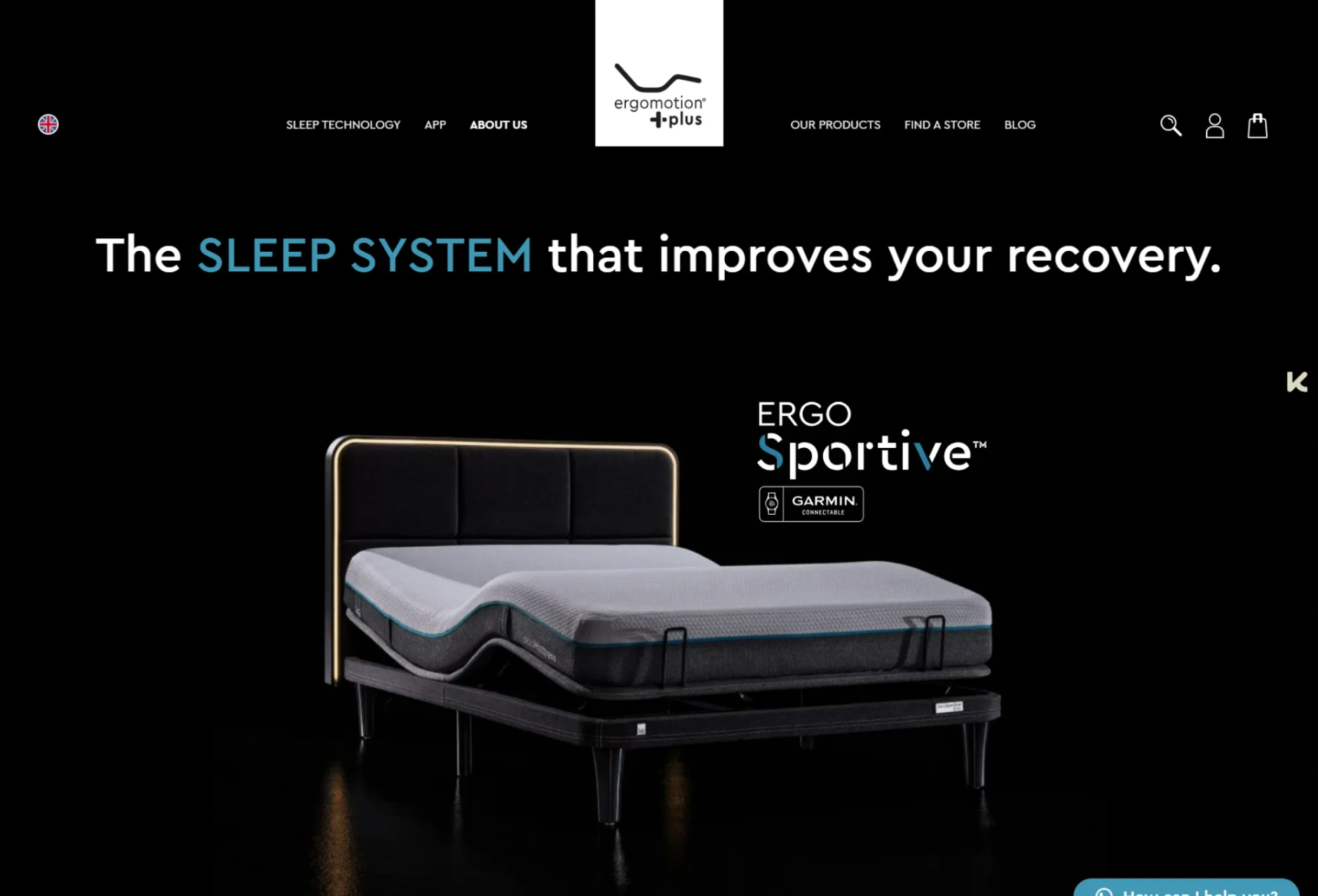
The Ergomotion Plus website after the redesign
The Ergomotion Plus website before the redesign
BeforeAfter

Branding

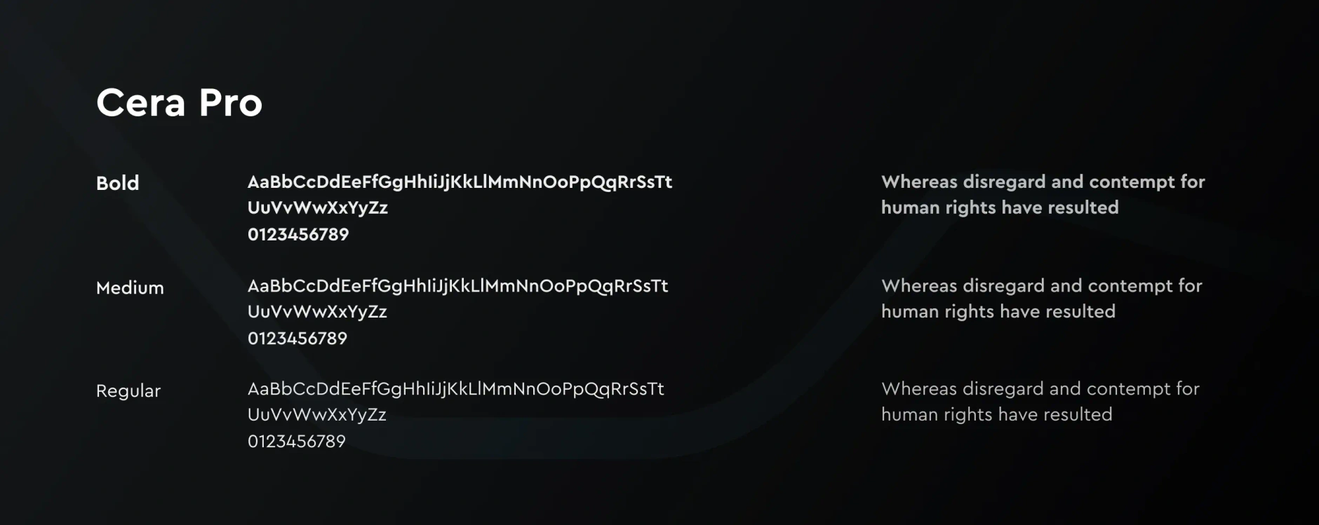
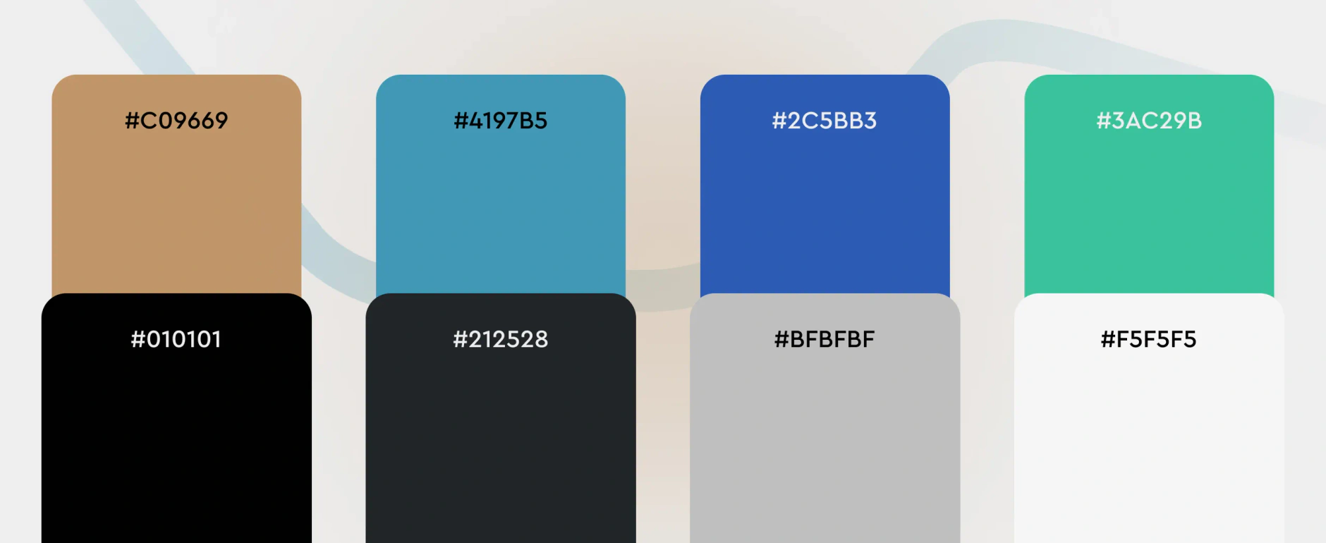
Ergomotion Plus typography sheet showing Cera Pro in bold, medium and regular weights on a dark backgroundErgomotion Plus colour palette with eight rounded swatches and hex values from #C09669 and #4197B5 to #F5F5F5

UX and UI Design

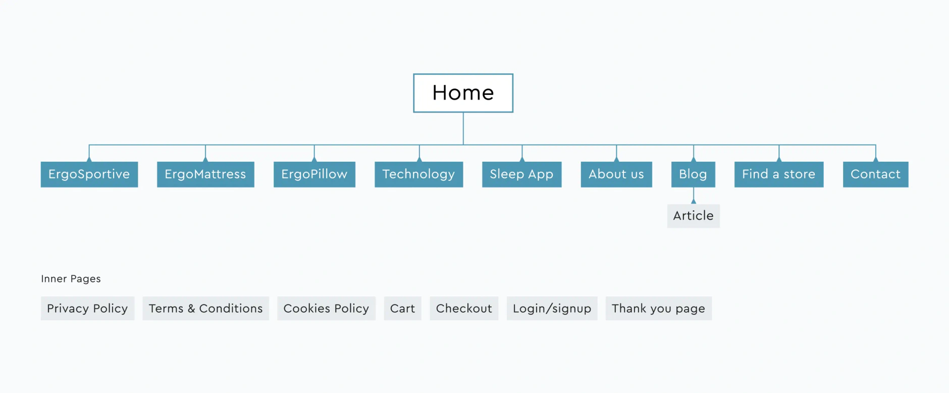
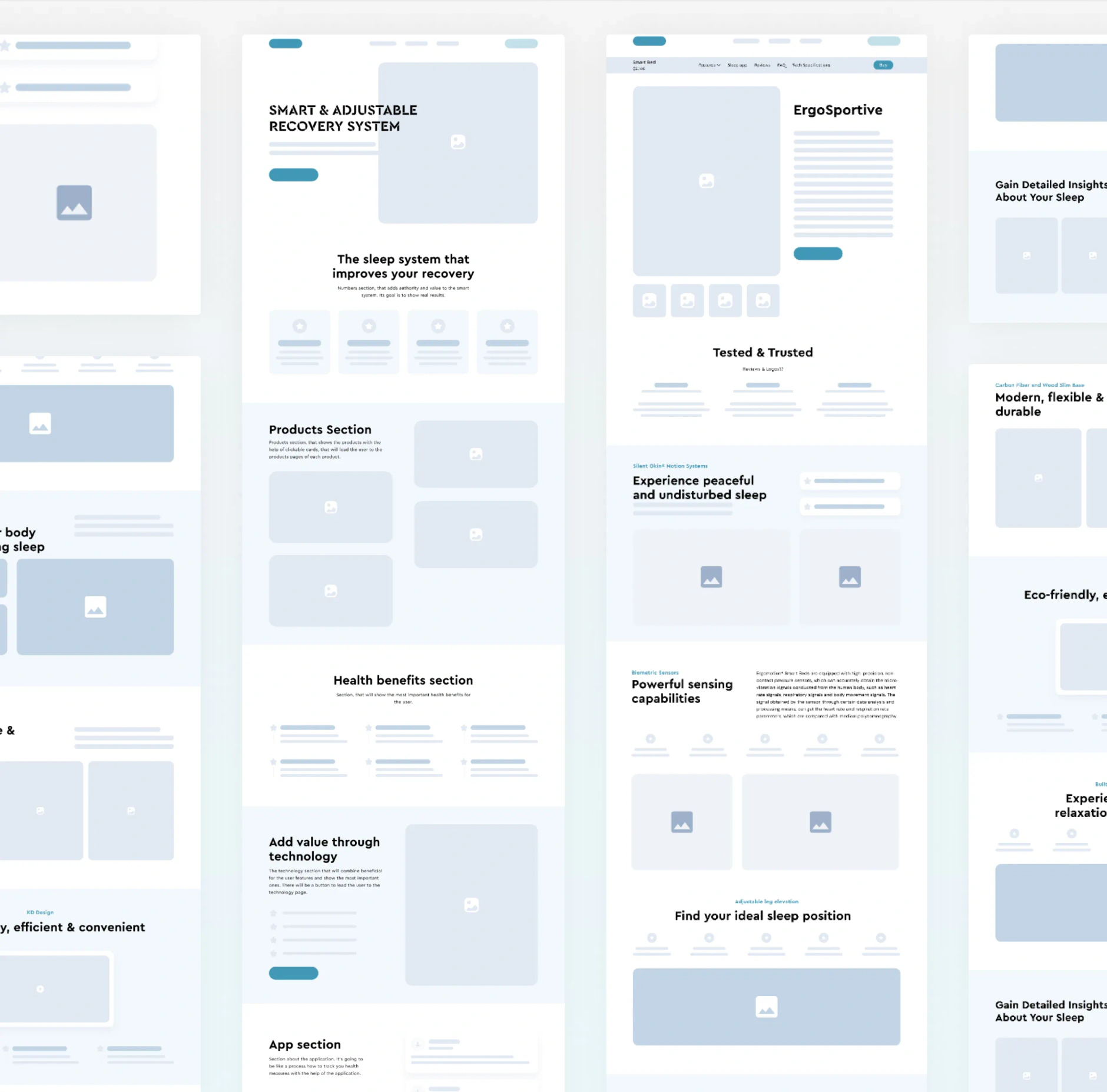
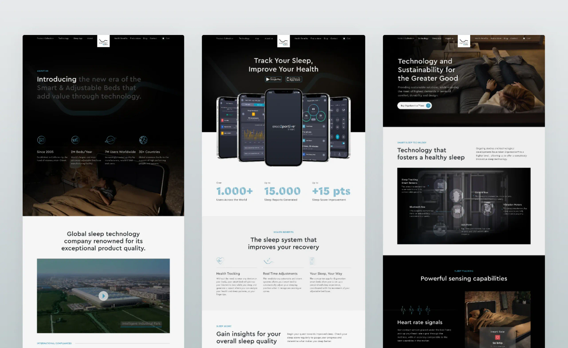
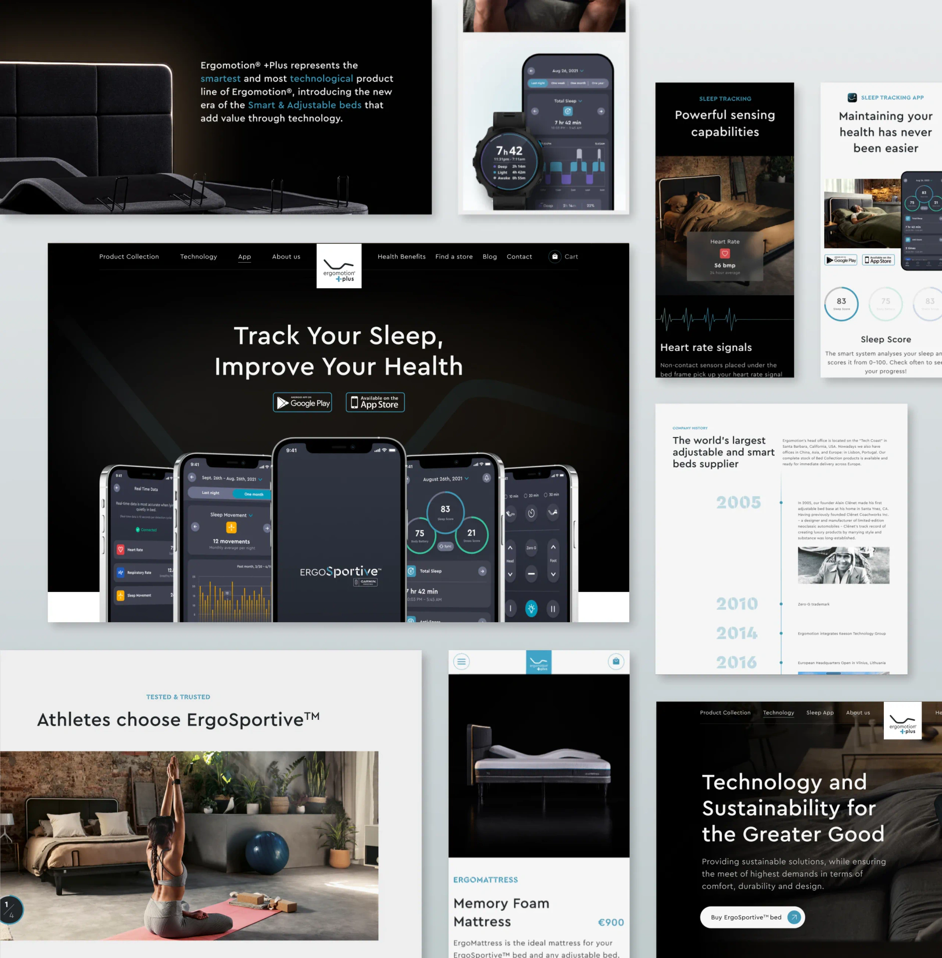
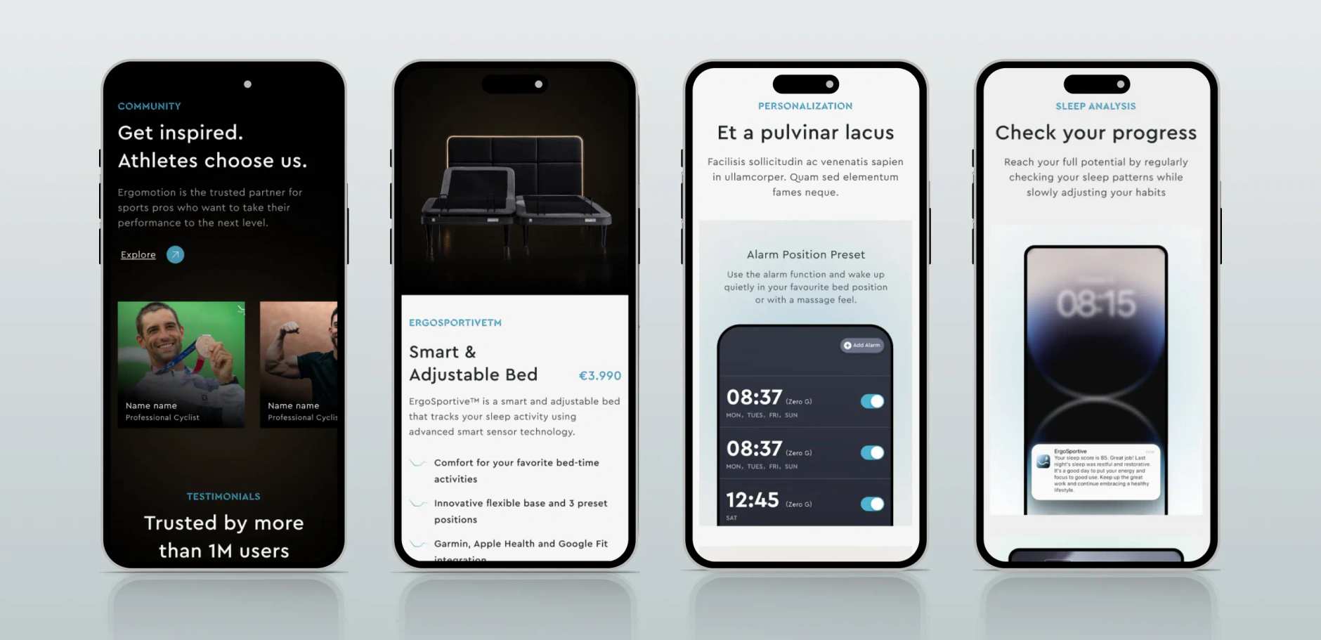
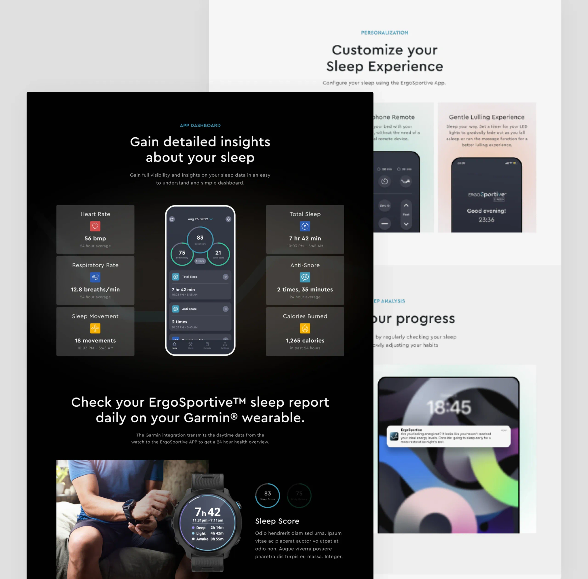
Ergomotion Plus sitemap tree branching from Home to product, technology, blog and store pages, plus inner utility pagesLow-fidelity Ergomotion Plus wireframes in blue and grey showing stacked product page sections and image placeholdersThree full-page Ergomotion Plus designs covering the about, sleep app and technology pages with dark bedroom photographyCollage of Ergomotion Plus page sections including the ErgoSportive app hero with phone mockups and a company history timelineFour Ergomotion Plus mobile screens showing the athlete community, smart bed product page, alarm presets and sleep progressErgomotion Plus app dashboard section with sleep metric tiles and a Garmin wearable panel, over lighter personalisation screens

Social Media Banners

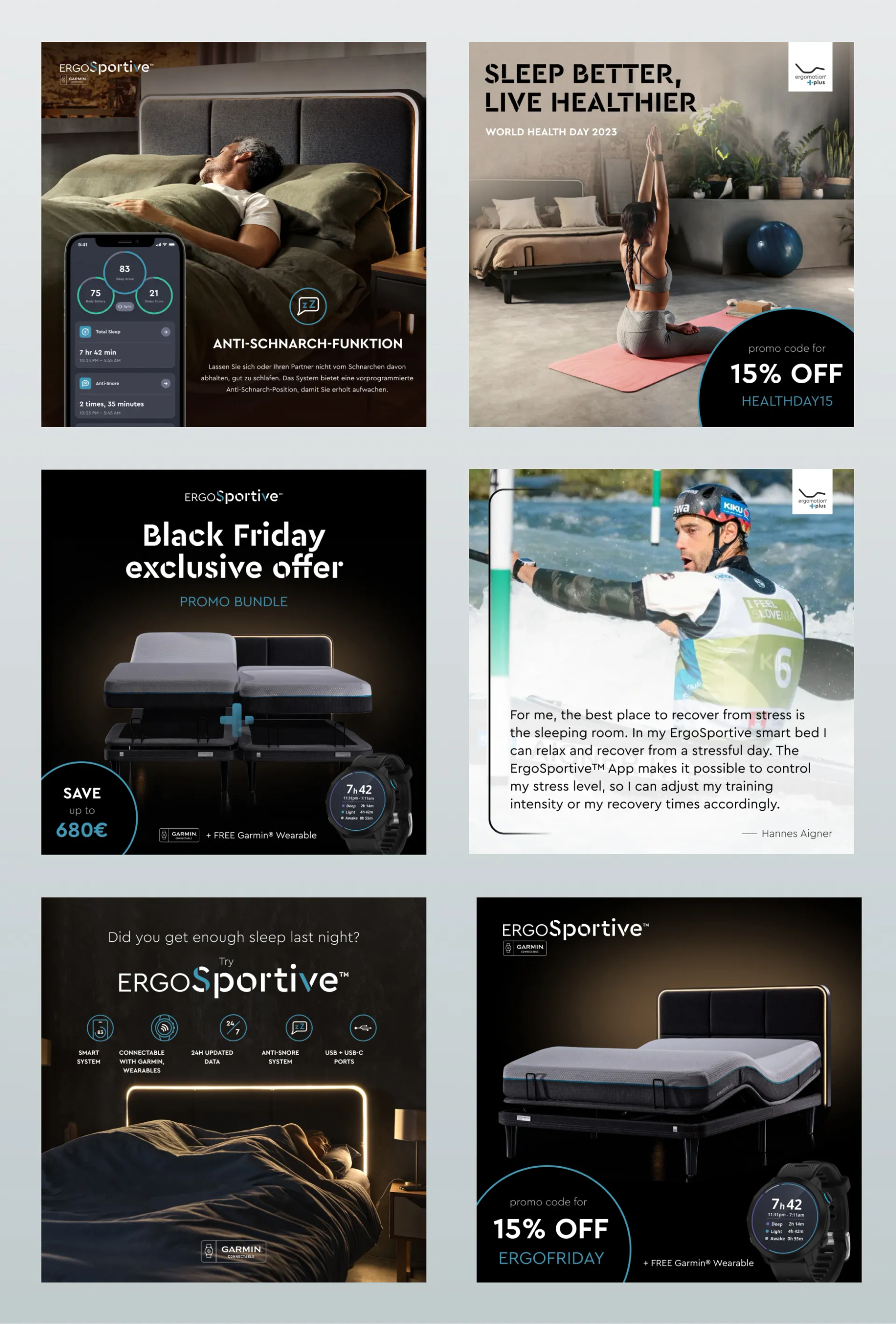
Six square Ergomotion Plus social media banners promoting the ErgoSportive smart bed, seasonal discounts and an athlete quote

Services we delivered

More work

Related case studies

View all work
FCS Capital Markets homepage hero with the animated globe, beside the Capital Markets service cards for Derivatives, Fixed Income and Investment Solutions

FCS Capital Markets

  • Finance
  • Consulting

FCS Capital Markets split its brokerage and securitisation businesses on one Webflow site: 30 pages live, 19 written by us and checked by compliance.

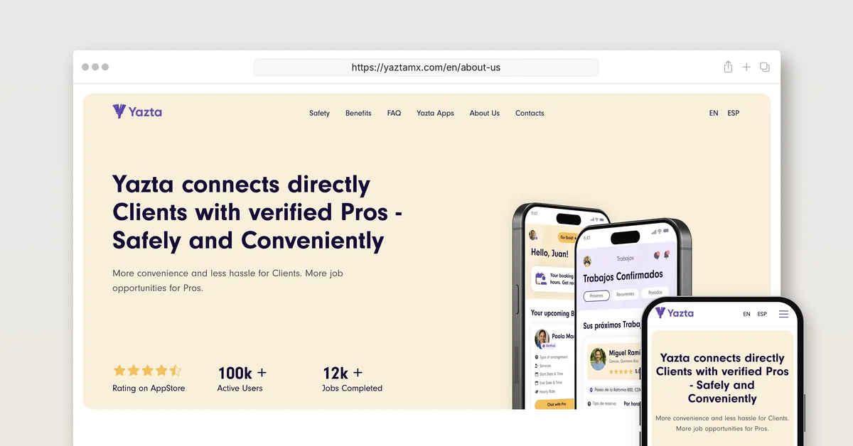
The yaztamx.com About Us page in a desktop browser and on a phone, headlined Yazta connects directly Clients with verified Pros - Safely and Conveniently

Yazta

  • Technology
  • Others

Creative Corner Studio built Yazta from a sentence: brand, two native apps, MVP in 12 months, the pre-seed deck, and a marketplace now past 90,000 users.

Let's talk about what your business needs next.

Whether you're planning a new website, getting more from the one you have, or improving your SEO and AEO visibility, tell us where you are. We'll come back within one business day with a clear next step.

Book a free intro call