Millions of households in Mexico hire domestic help every day, and almost none of it runs on real infrastructure. Verification, fair pay and reliable booking happen through informal channels. Yazta's founders saw the gap. What they did not have was a product team, a designer, a developer, or a single screen.
Most agencies start when the brief is written. This brief was a sentence and a vision. We worked as Yazta's product, design and engineering team rather than a vendor delivering a spec.
Branding from zero
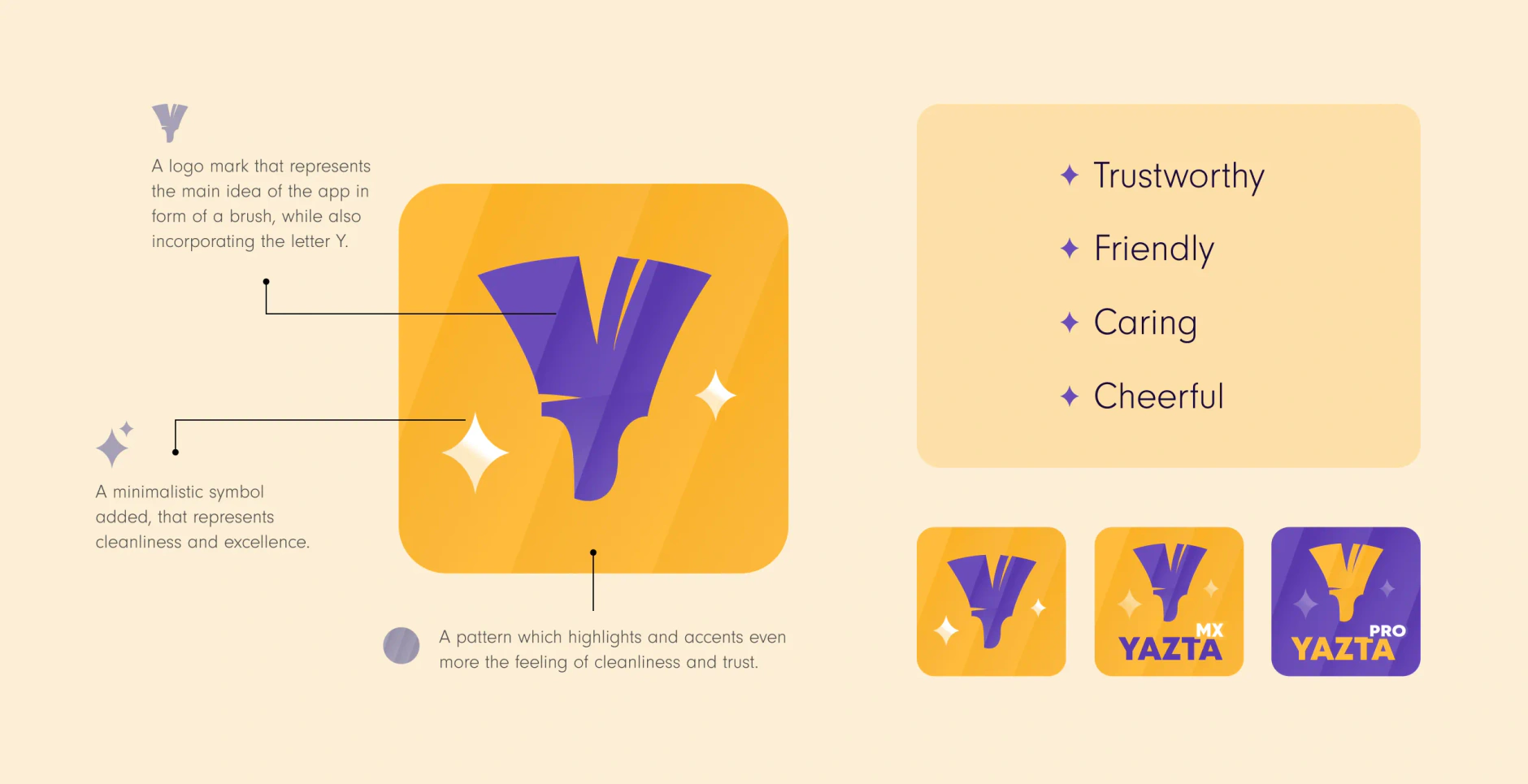
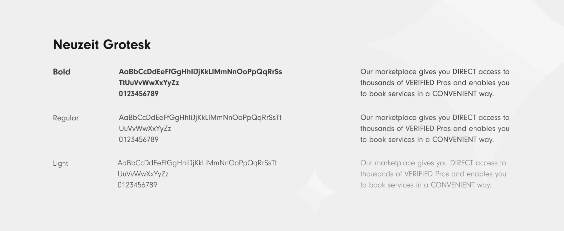
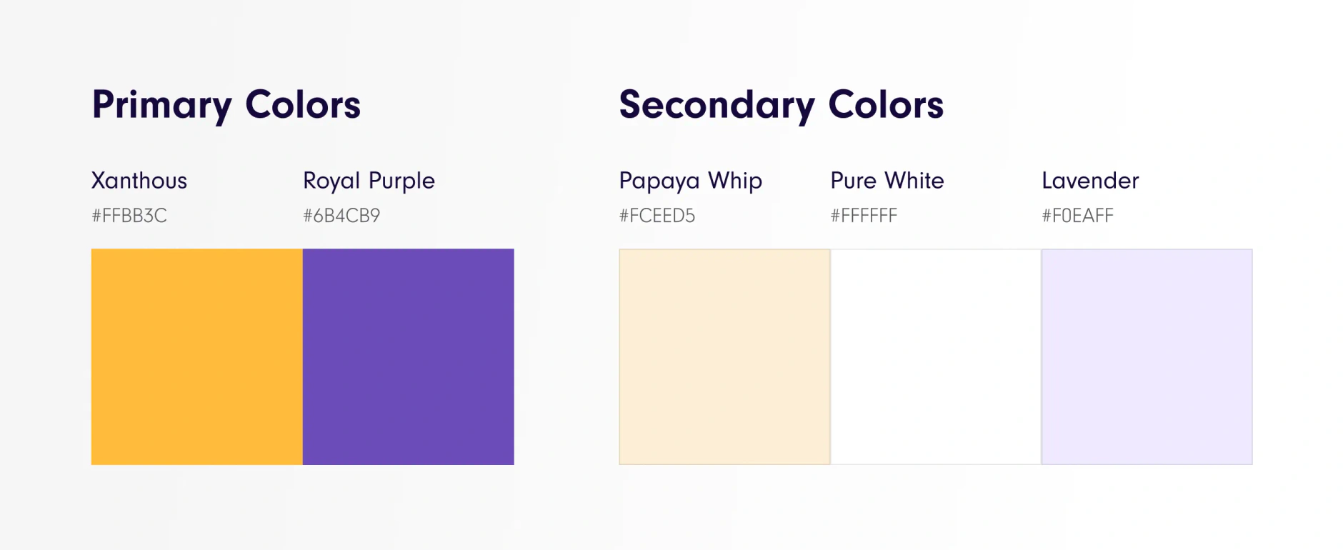
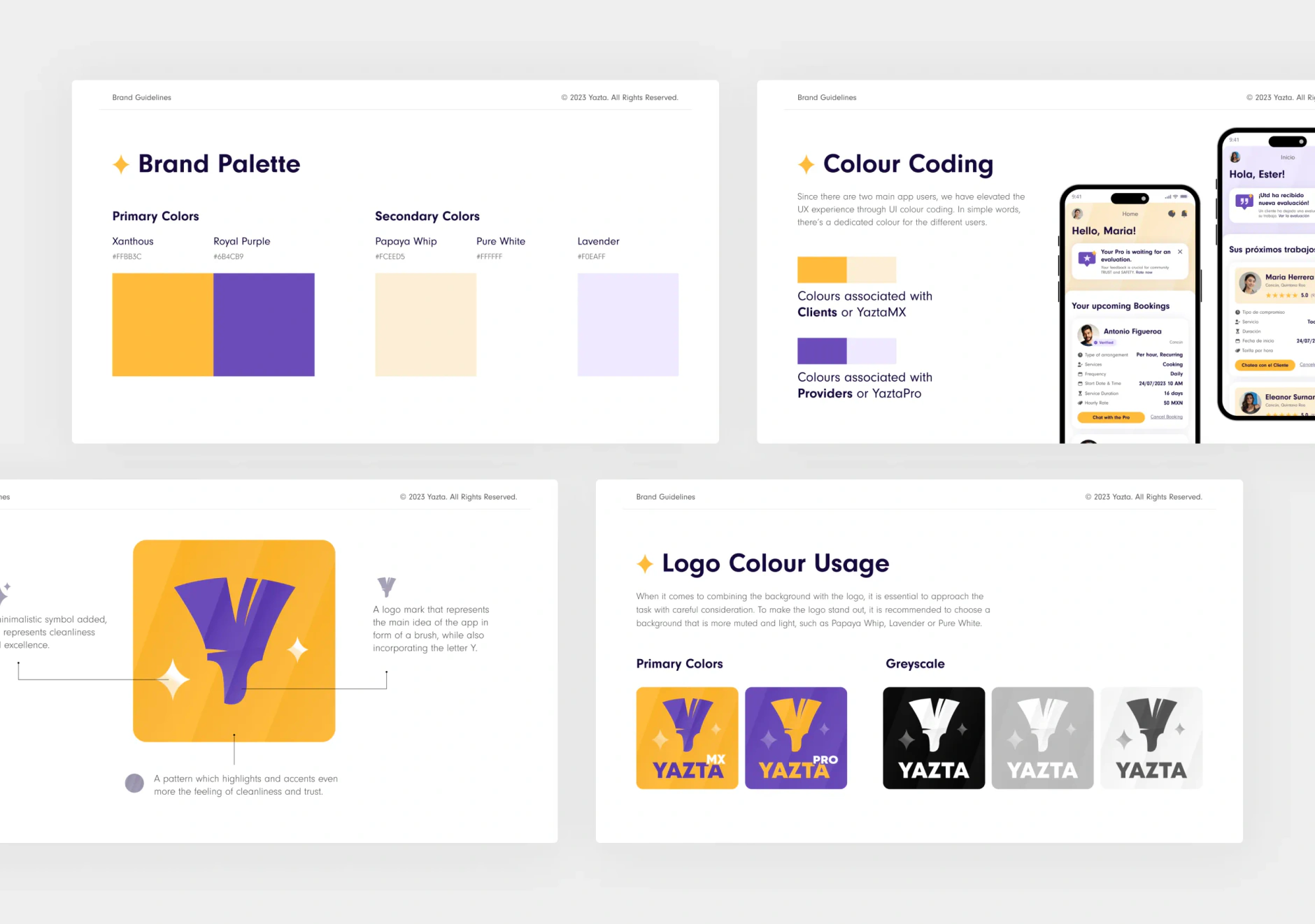
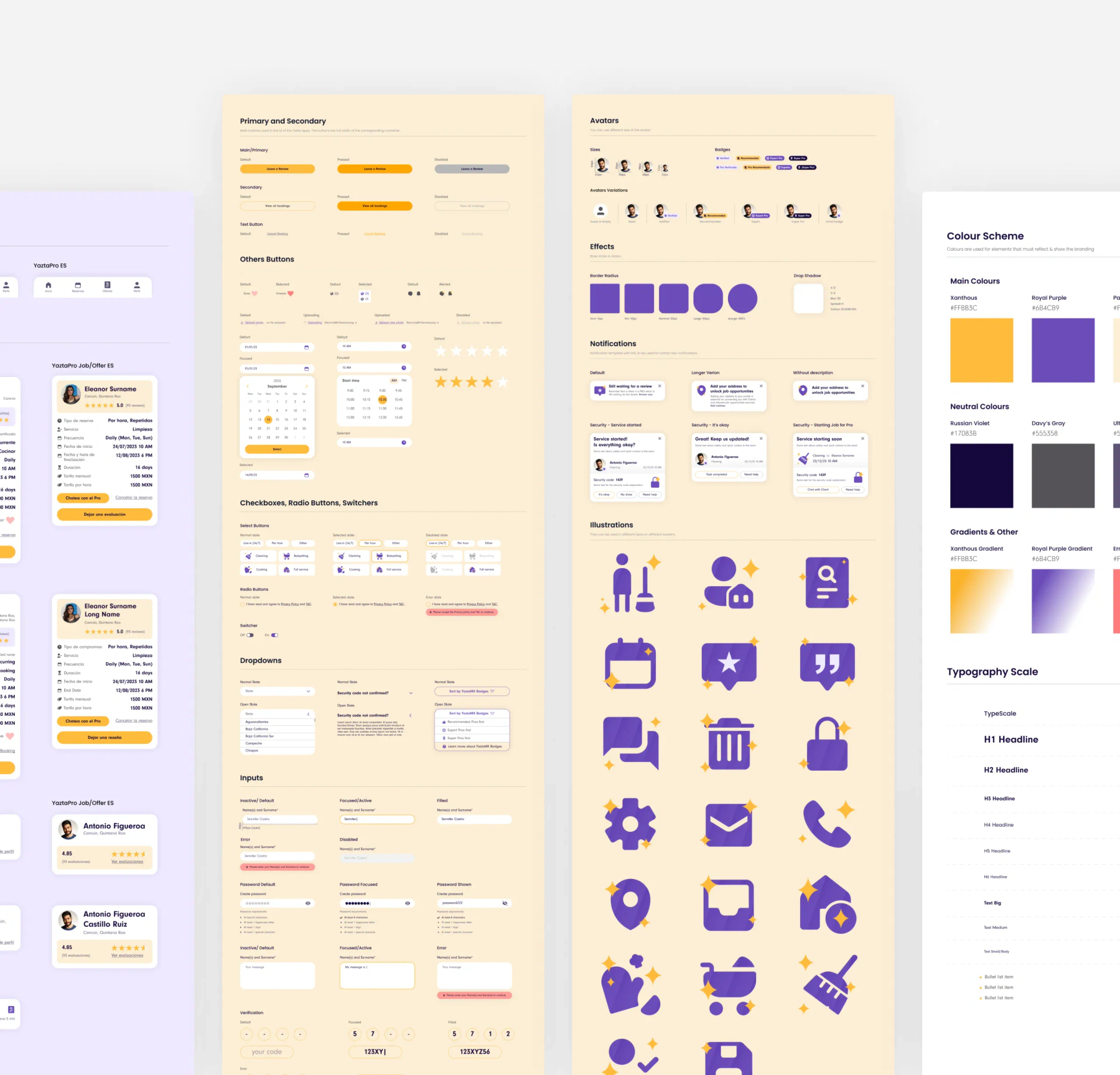
There was no brand to inherit. We built the Yazta identity from naming context through the full visual system: logo, colour, typography, illustration style and tone of voice, designed for the Mexican market to read as warm, professional and trustworthy. Brand and UX were designed as one system, so the MVP felt like a product rather than a stitched prototype.
Product strategy
A two-sided marketplace means two apps, two user flows and two onboarding paths, all anchored to one verification system. We mapped the full architecture before any code was written, and scoped the feature set in tiers so every feature had to defend itself to investors first.
- The client journey: find, book and pay a verified professional.
- The worker journey: receive offers, accept work, get paid fairly.
- Verification as the trust anchor holding both sides together.
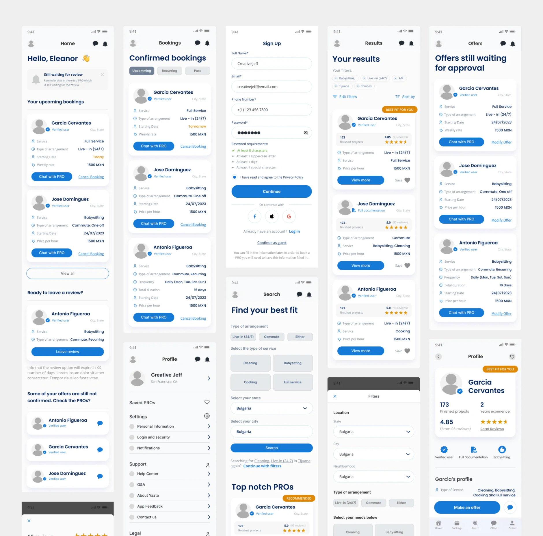
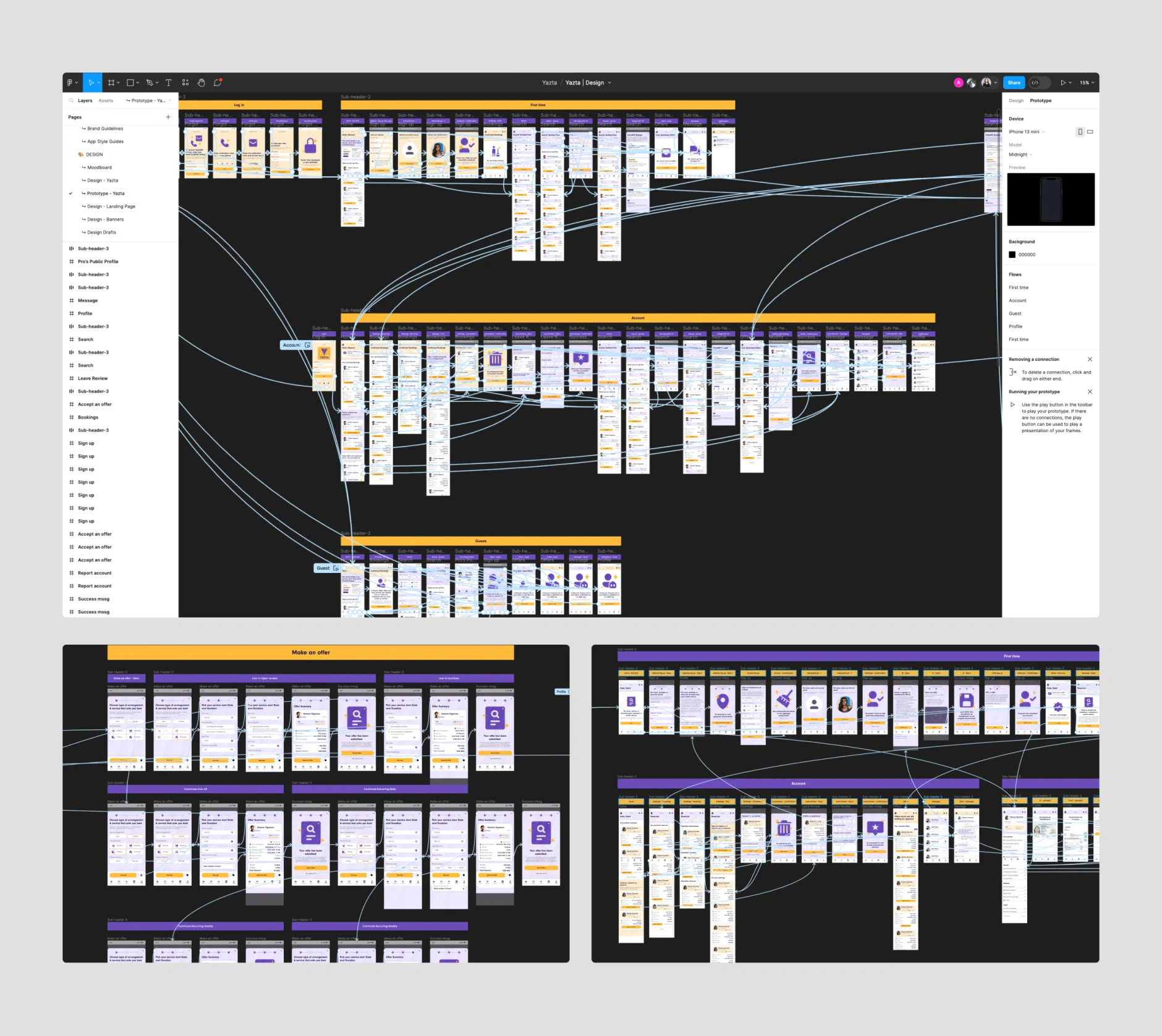
Mobile app design and development
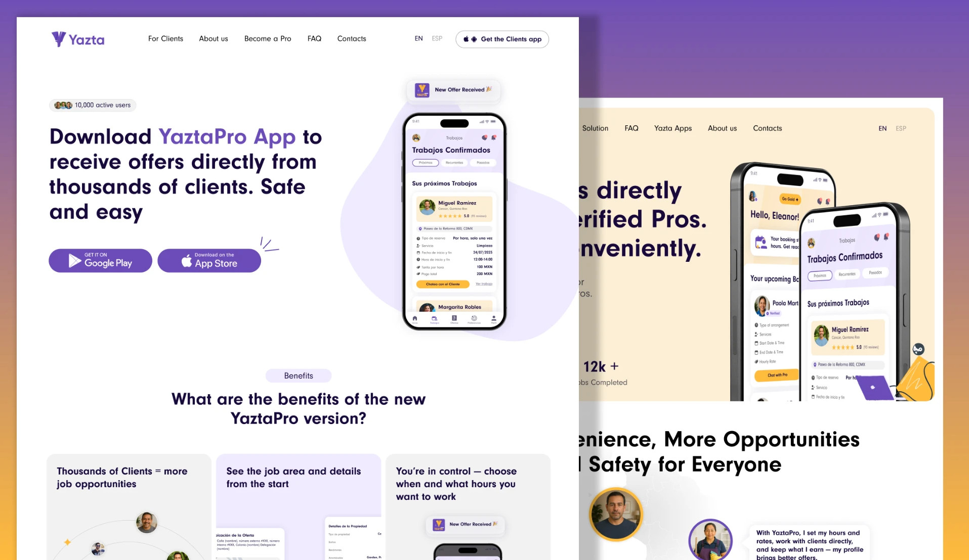
We designed and built two native apps: YaztaMX for clients and YaztaPro for workers, shipped on iOS and Android in both Spanish and English. The MVP had to move fast enough to fundraise against and still be credible enough to onboard real workers and real clients. It shipped in 12 months.
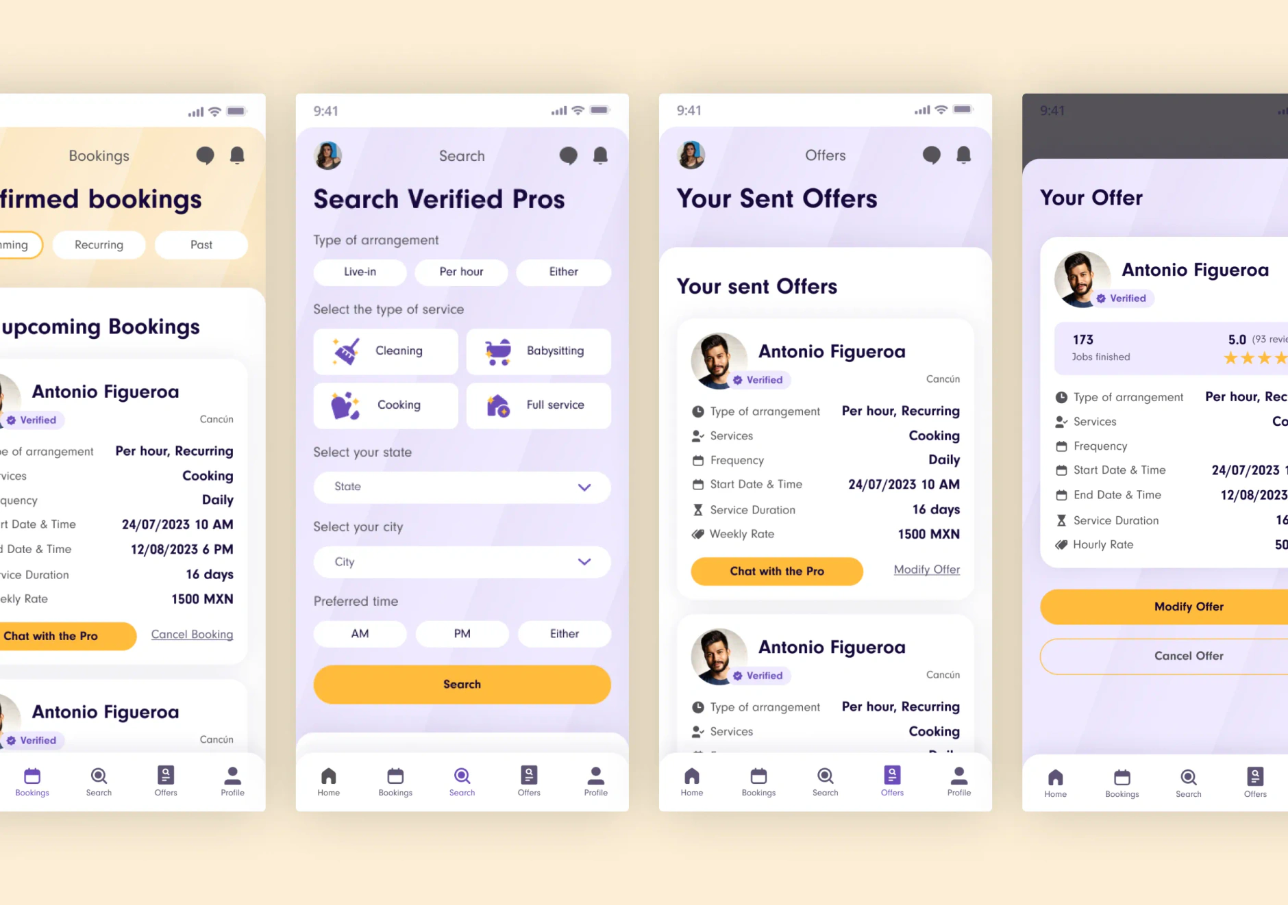
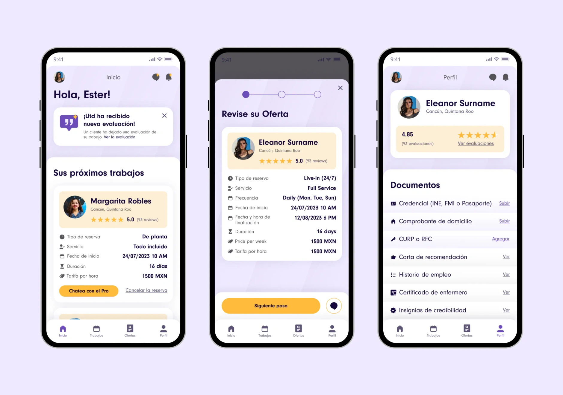
The raise, and what came after
Once the MVP was live we built the investor deck, translating the product vision into an investor narrative with proof from a working app behind it. Yazta closed its pre-seed round after launch.
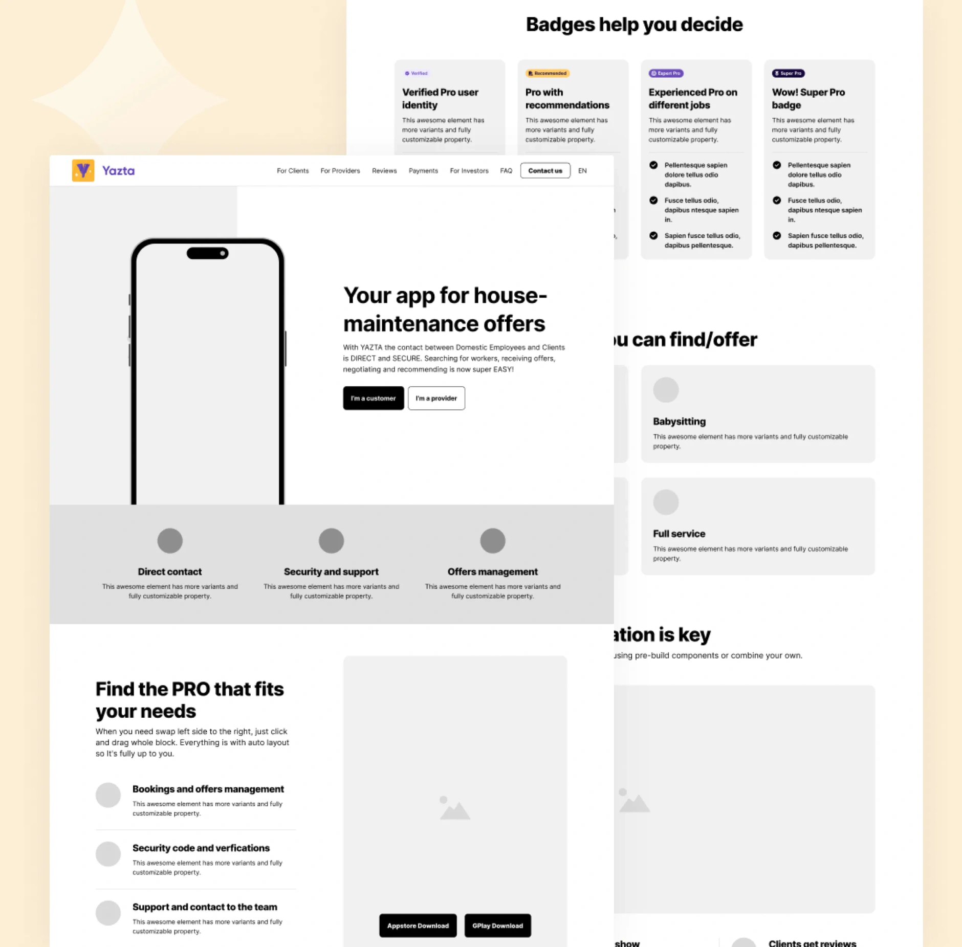
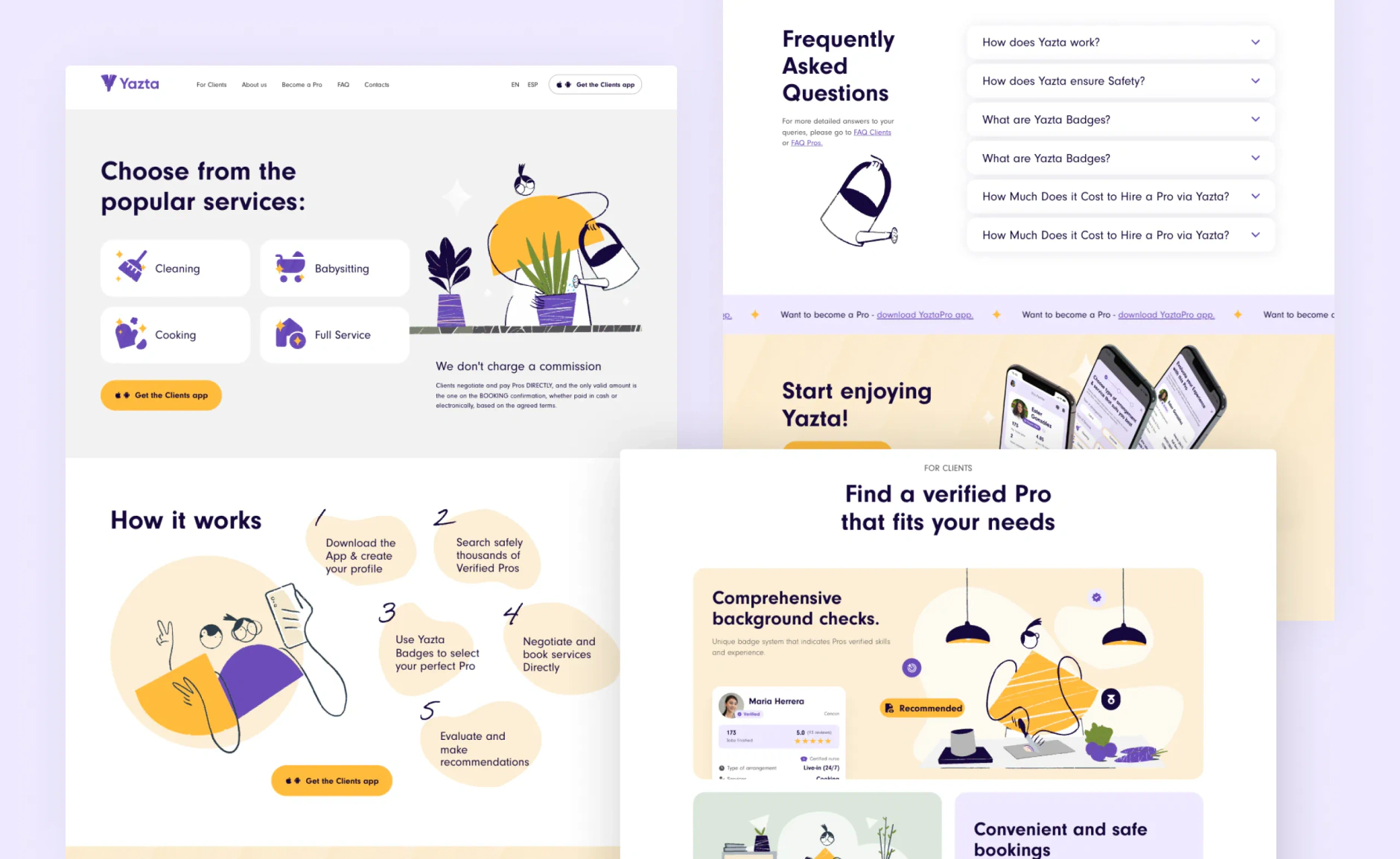
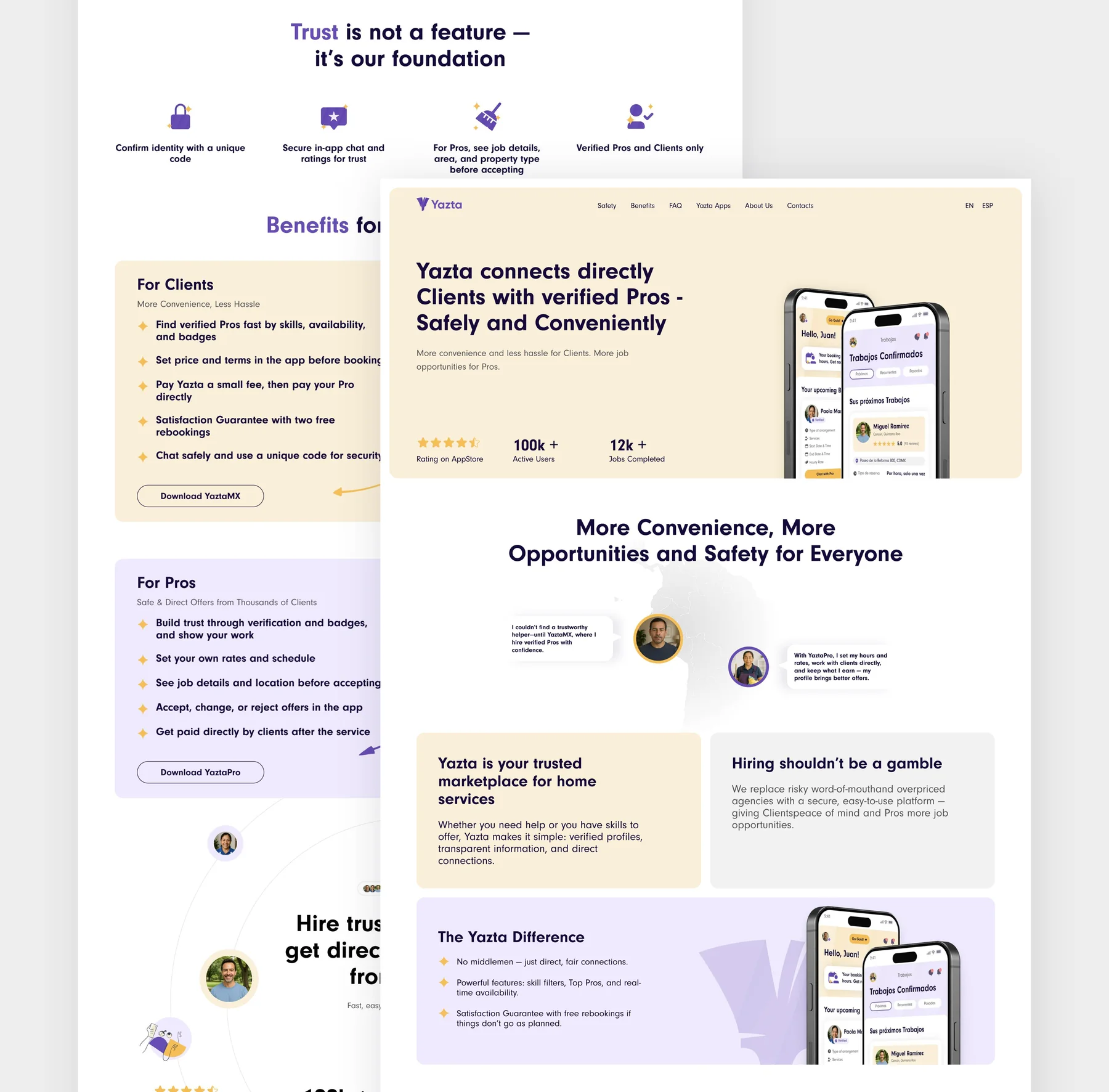
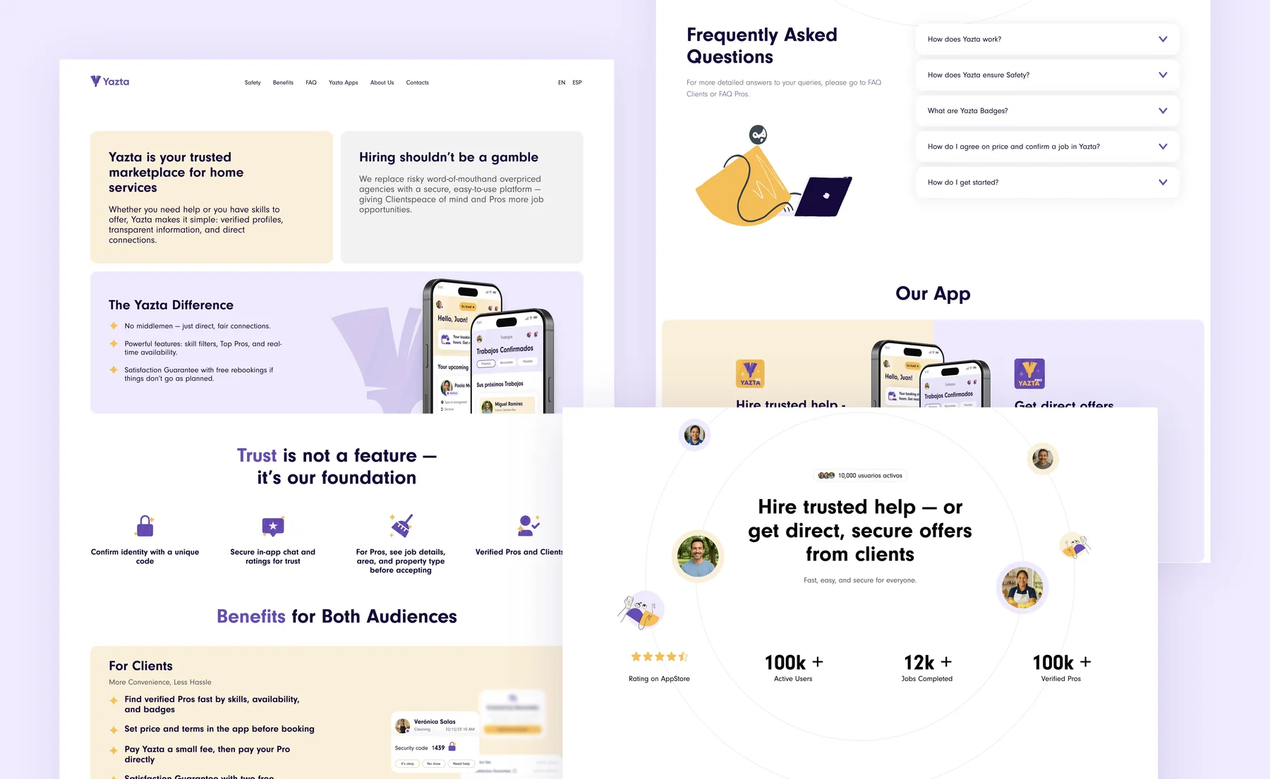
The MVP did better than anyone planned for, so the partnership kept going. We ran a second product sprint on the back of that success: new user flows, a wider feature set and a hardened backend, moving Yazta from MVP to a production marketplace handling real bookings. We then designed and built the bilingual marketing site at yaztamx.com as the public face of the brand.

The partnership
Three years on, the engagement is still running as an active product, design and growth retainer. Yazta operates in CDMX and Estado de Mexico with national expansion underway, and is raising its seed round.
The Results
| Metric | Result | Context |
|---|---|---|
| 90,000+ users on the platform | Live in market on iOS and Android, across both the client and worker apps. | |
| 12 months from idea to MVP | From a one-sentence brief to a shipped, fundable product on two platforms in two languages. | |
| Pre-seed closed after MVP launch | Raised on the deck we built, with proof from the working app. Seed round in progress. | |
| A second product sprint | The MVP's success funded an expanded feature set, new flows and a hardened backend. | |
| 2 markets live | CDMX and Estado de Mexico, with national expansion underway. | |
| 3+ years and counting | Continuous product, design and growth partnership since 2023. |
Services we delivered
- Brand Identity: the Yazta brand from zero: naming context, logo system, colour, typography, illustration style and tone of voice
- Product Strategy: two-sided marketplace architecture, both user journeys, verification model, and feature tiering by funding stage
- Mobile App Design & Development: YaztaMX and YaztaPro designed and built as native iOS and Android apps in Spanish and English
- Pitch Deck: the investor deck behind the pre-seed raise, built on proof from the live MVP
- Product Expansion: a second sprint after the raise: new flows, wider feature set, hardened backend
- Marketing Website: bilingual yaztamx.com, built to drive app downloads on both sides of the marketplace
- Ongoing Retainer: active product, design and growth support since 2023