B-Eye: Complete redesign for a Data Analytics Company

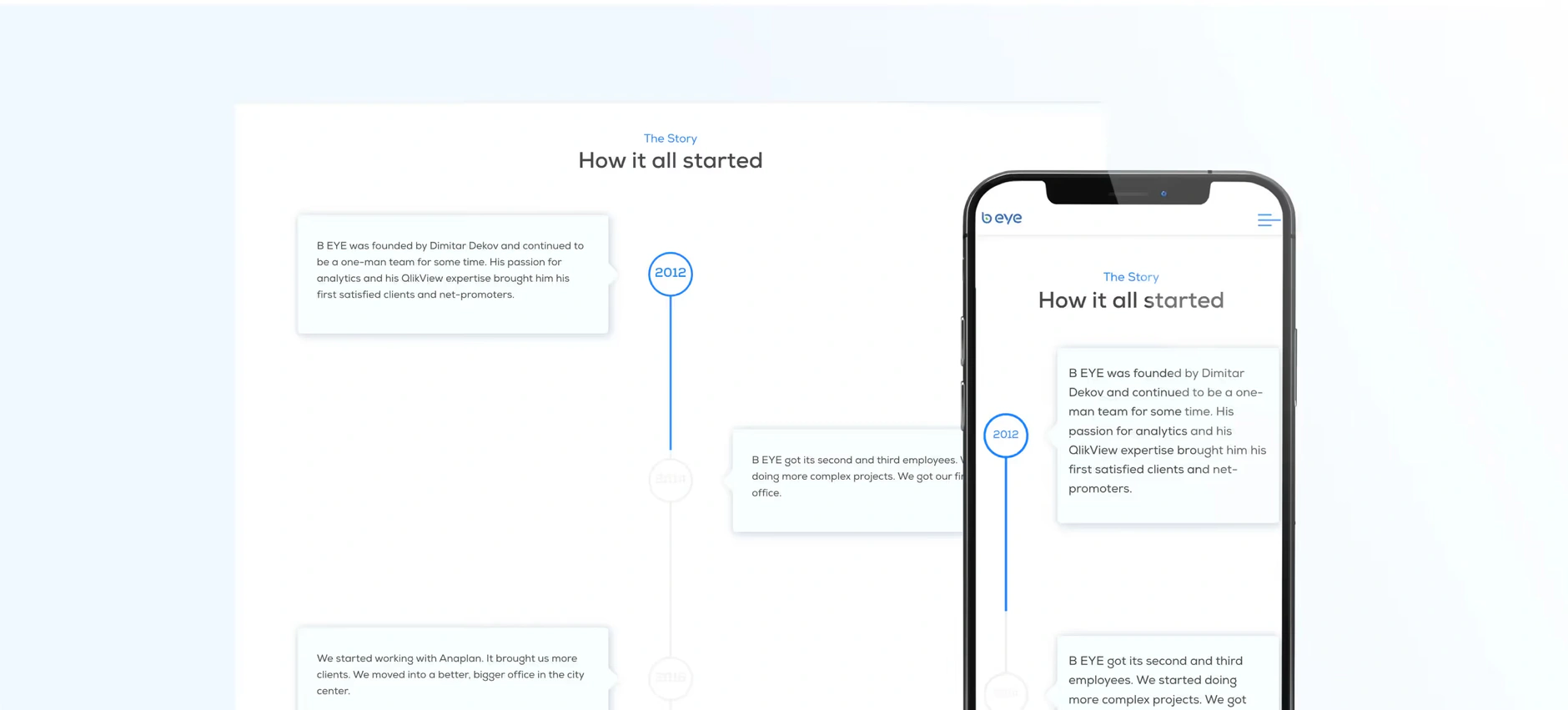
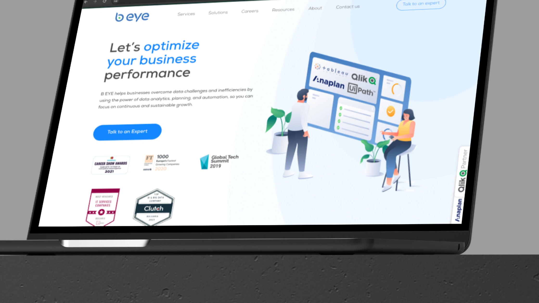
The B-Eye website on a laptop
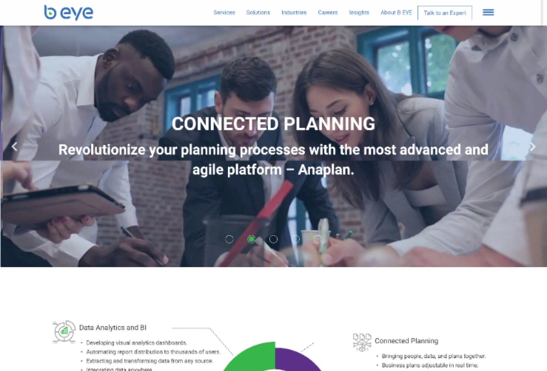
B EYE's existing website exhibited three main problems: an outdated design that didn't align with their innovative services, poor user experience due to confusing navigation and dispersed essential information, and a lack of effectiveness in driving user engagement and generating new business leads.
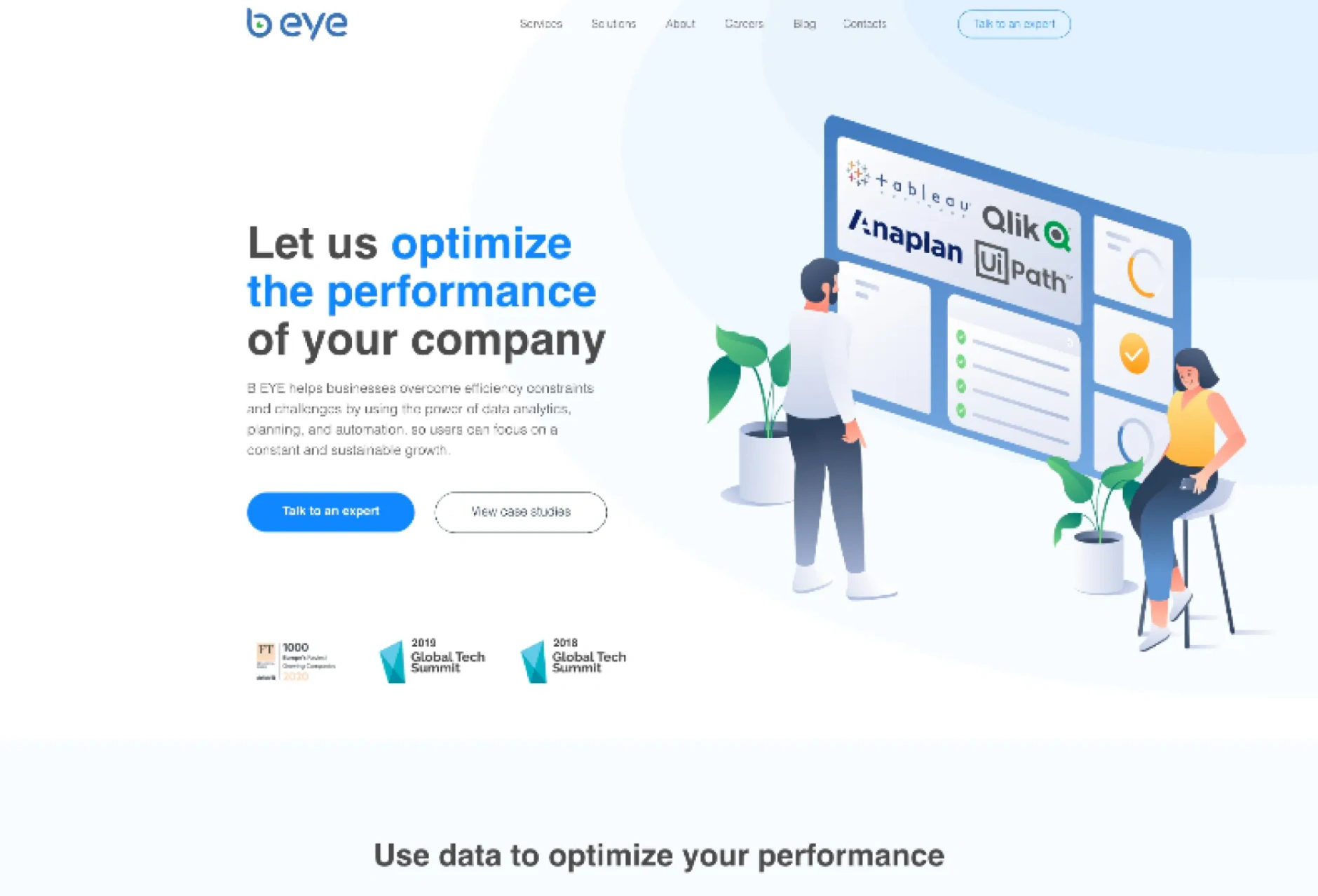
The B-Eye website after the redesign
The B-Eye website before the redesign
BeforeAfter

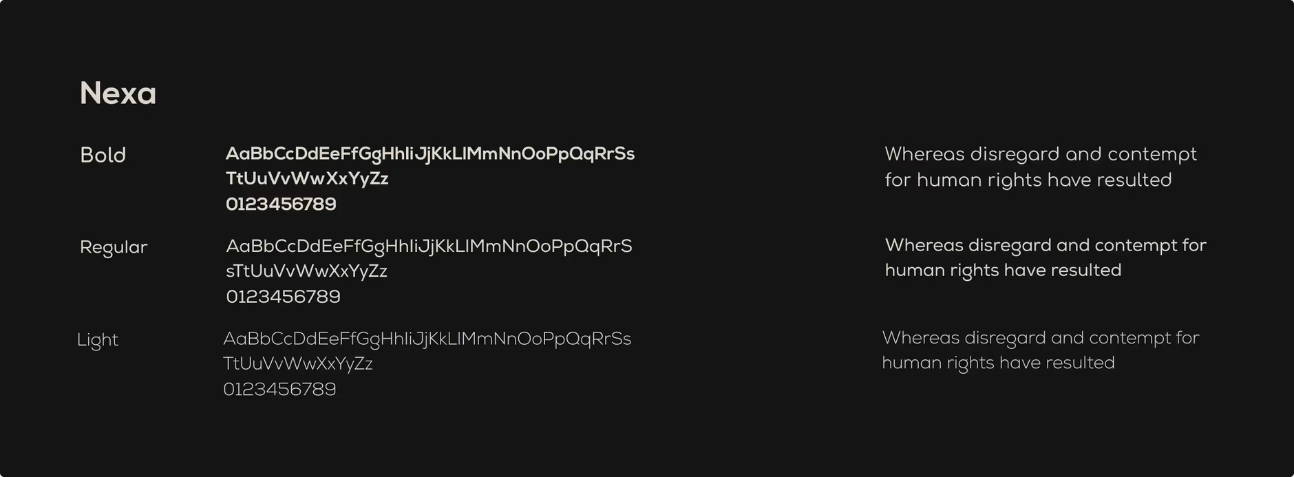
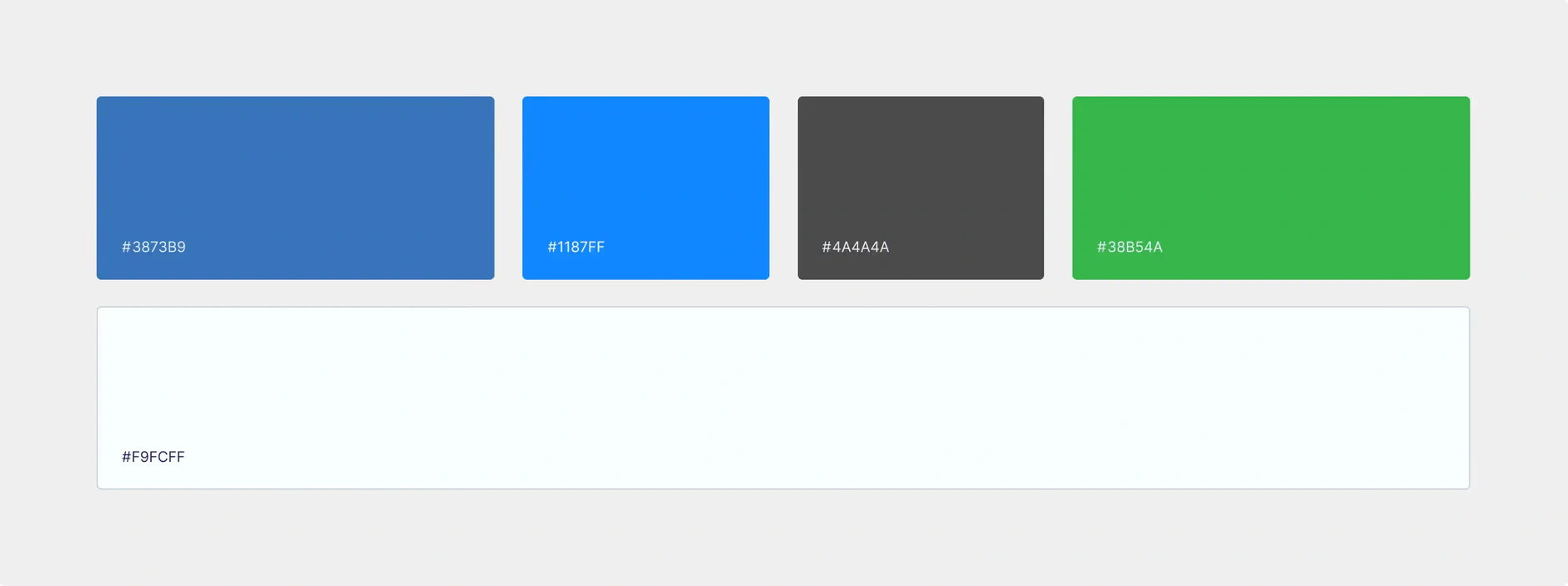
Branding

The fonts used for B-eye's websiteColor palletes used for B-eye's website

Web Design

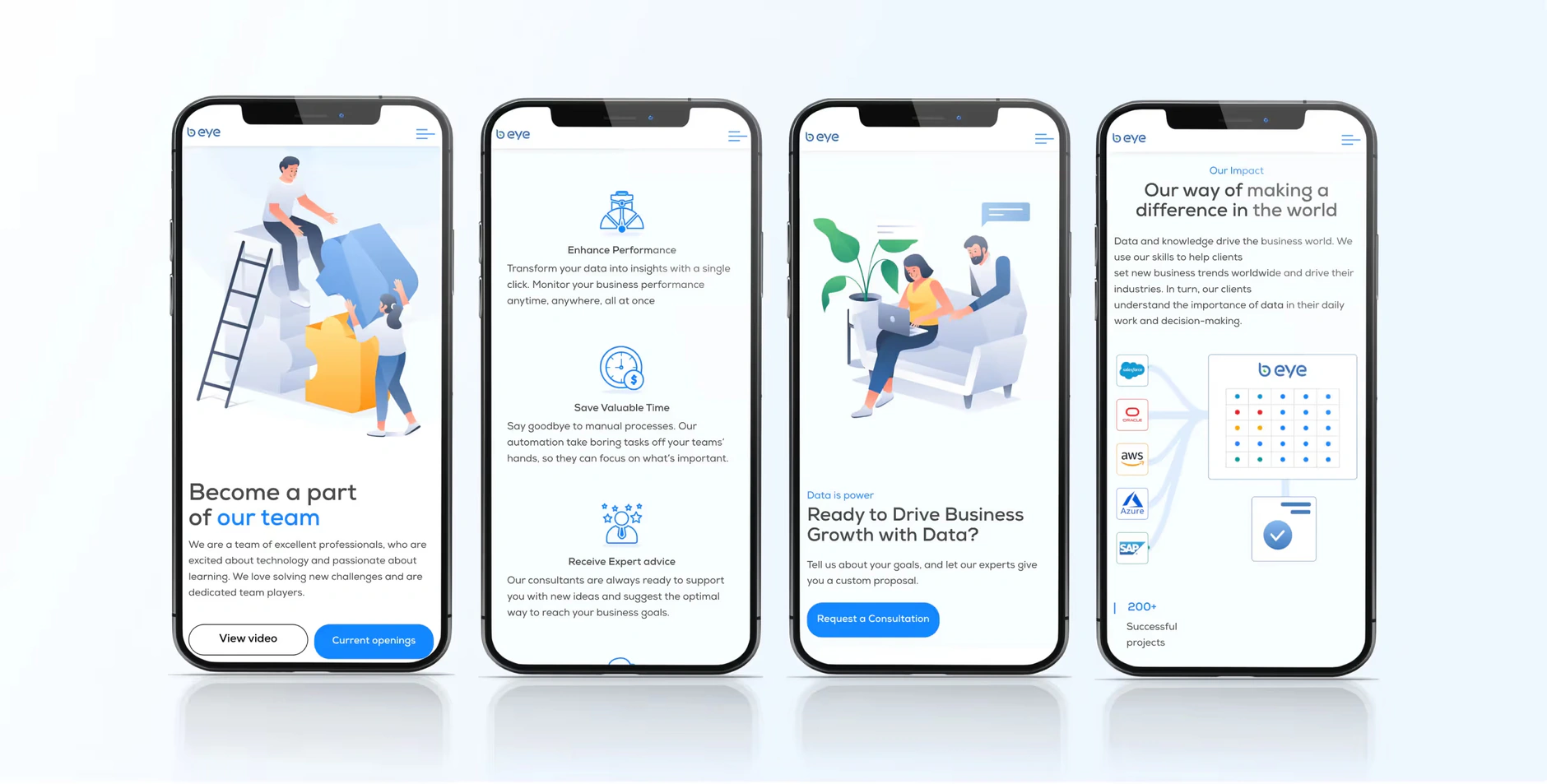
In addition to having engaging copy and visuals, we integrated a lead capture form prominently on the homepage to capture visitor information. We also added relevant CTAs and intuitive contact forms to encourage users to reach out to B EYE.
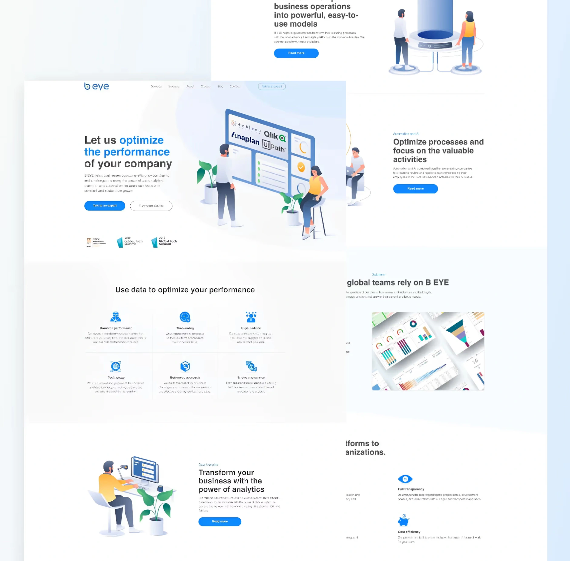
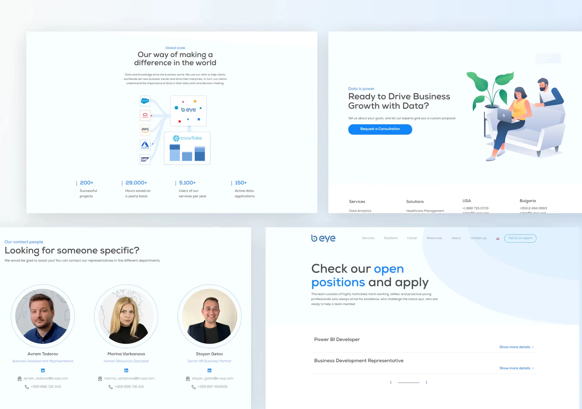
B-eye's homepageB-eye's website landing pagesBeye's website on mobile versionImage of B-eye's "How it started" story on a mobile device

Services we delivered

More work

Related case studies

View all work
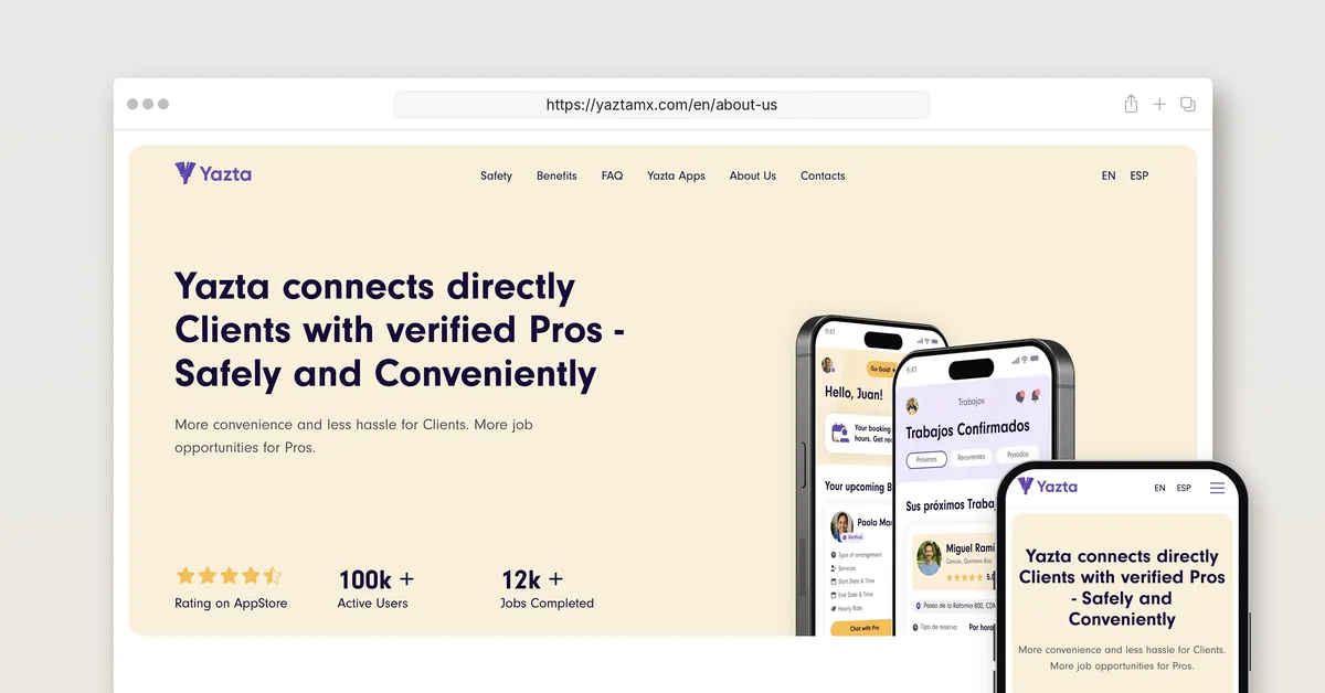
The yaztamx.com About Us page in a desktop browser and on a phone, headlined Yazta connects directly Clients with verified Pros - Safely and Conveniently

Yazta

  • Technology
  • Others

Creative Corner Studio built Yazta from a sentence: brand, two native apps, MVP in 12 months, the pre-seed deck, and a marketplace now past 90,000 users.

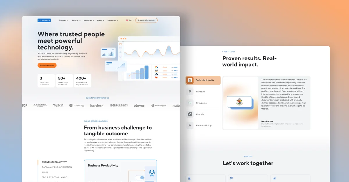
Cloud Office homepage design: the Where trusted people meet powerful technology hero beside the Proven results case studies section

Cloud Office

  • Technology

Creative Corner Studio designed and built Cloud Office's website in English, Bulgarian and Greek, launched 3 November 2025, with 292 URLs live today.

Let's talk about what your business needs next.

Whether you're planning a new website, getting more from the one you have, or improving your SEO and AEO visibility, tell us where you are. We'll come back within one business day with a clear next step.

Book a free intro call