Transforming Gauss’s Online Experience

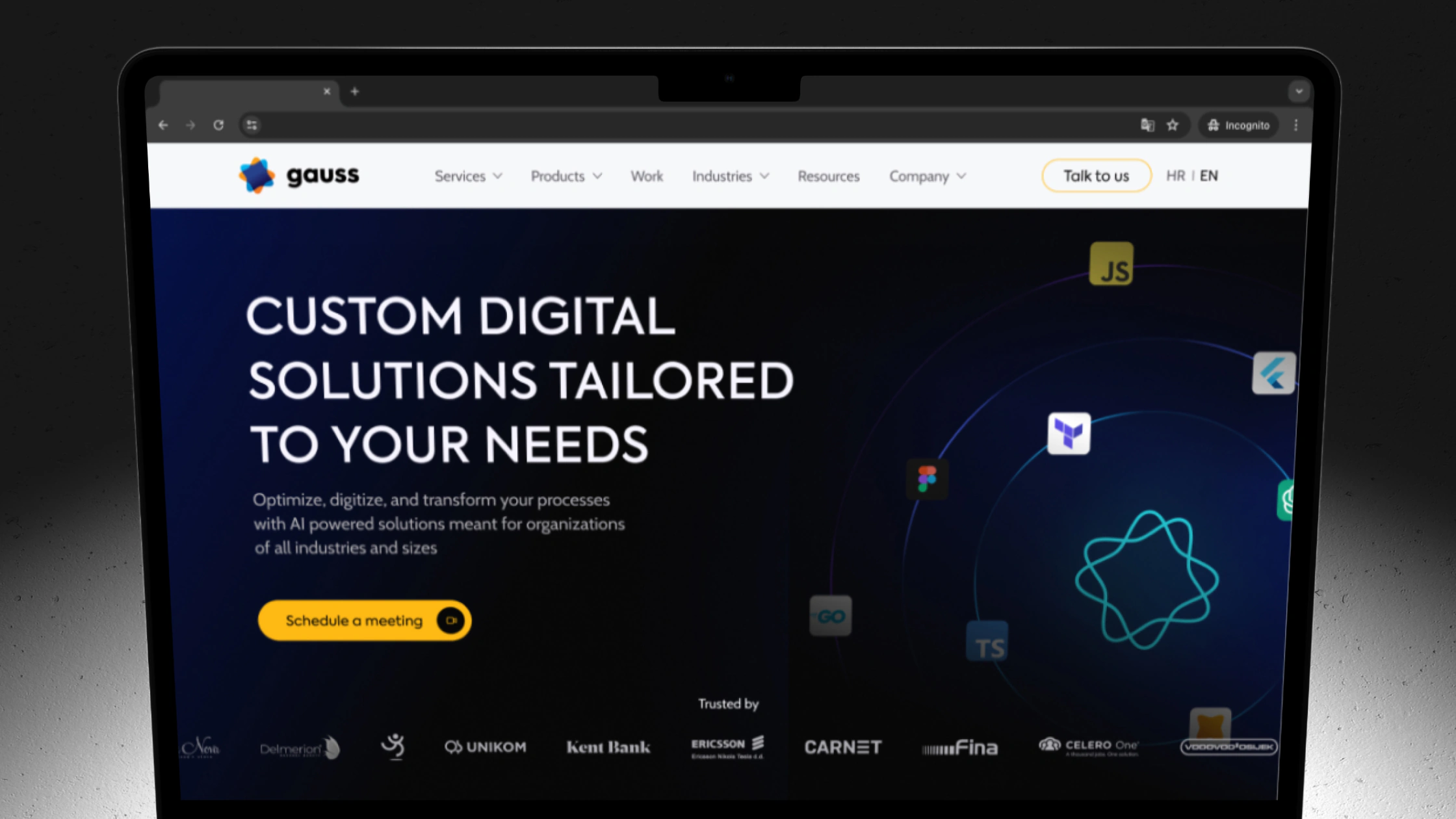
The Gauss website on a laptop
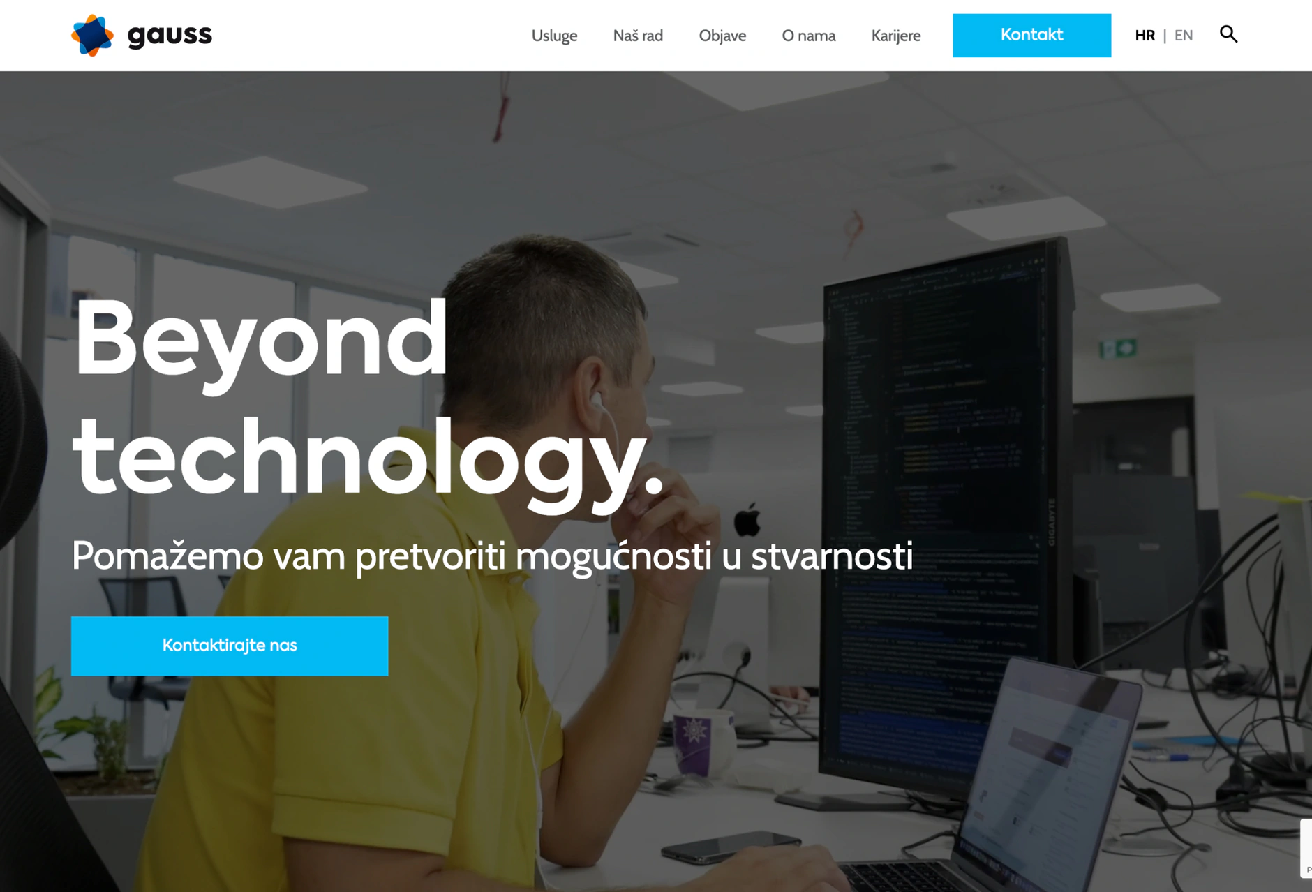
Gauss’s outdated website no longer reflected their professional status as a leading IT company in Croatia. They needed a modern, user-friendly platform to showcase their award-winning services and valuable resources. Our team redesigned their website, creating a fresh, engaging, and professional look that is easy to navigate and highlights their innovative solutions. This redesign allows Gauss to focus on their ongoing projects while presenting a compelling online presence to attract new clients and support their community.
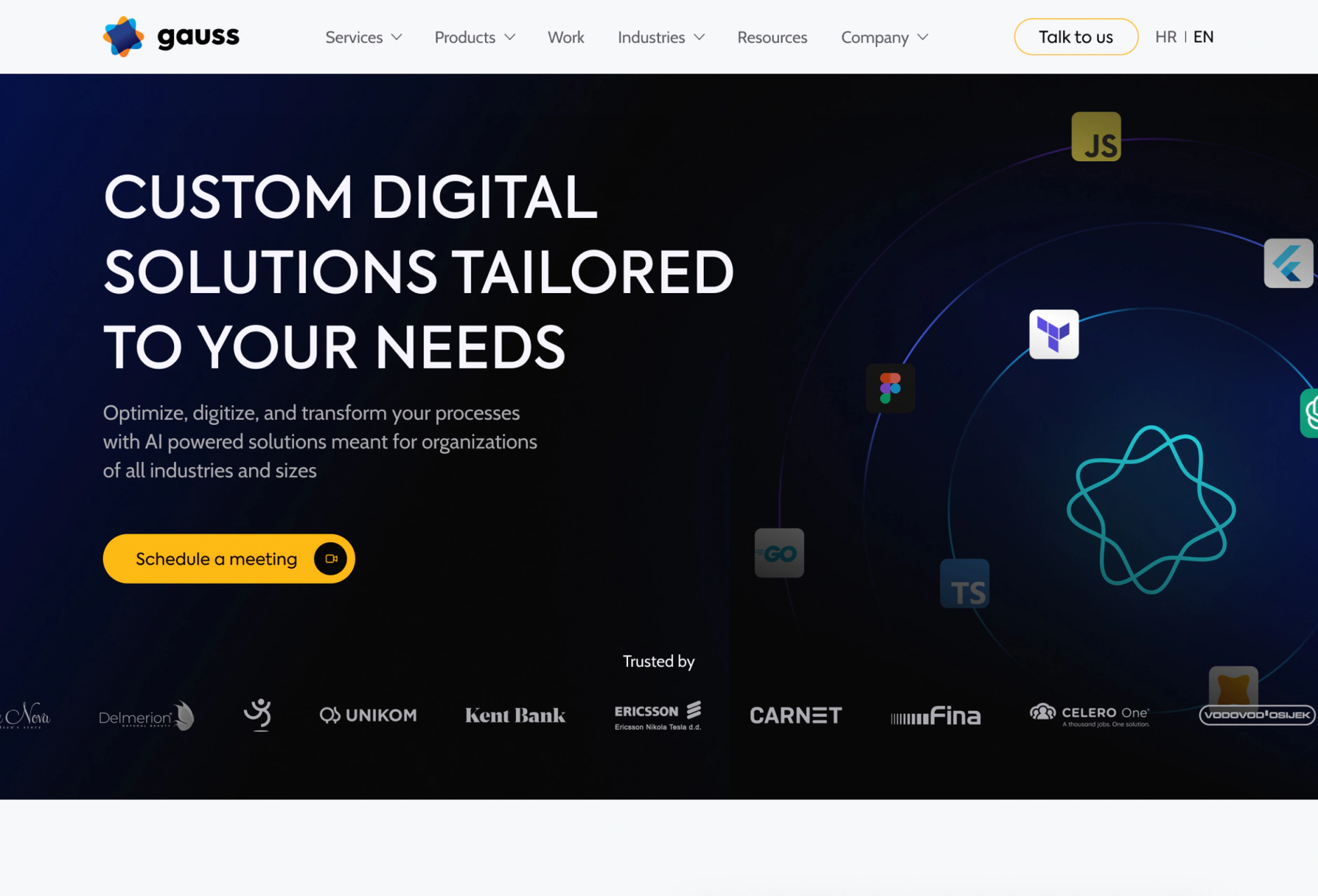
The Gauss website after the redesign
The Gauss website before the redesign
BeforeAfter

Branding

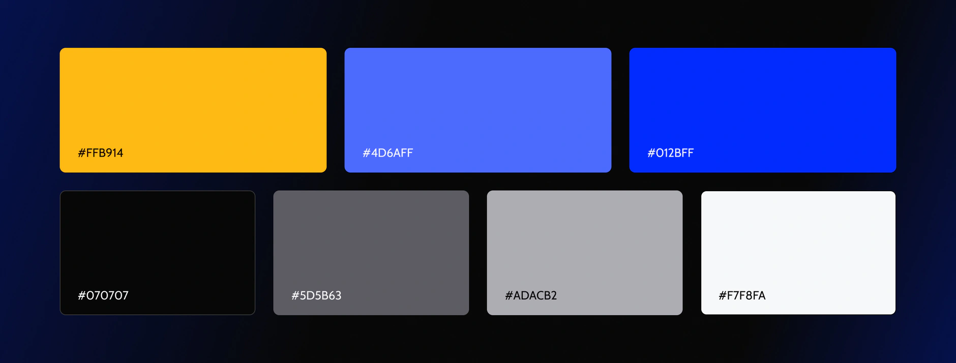
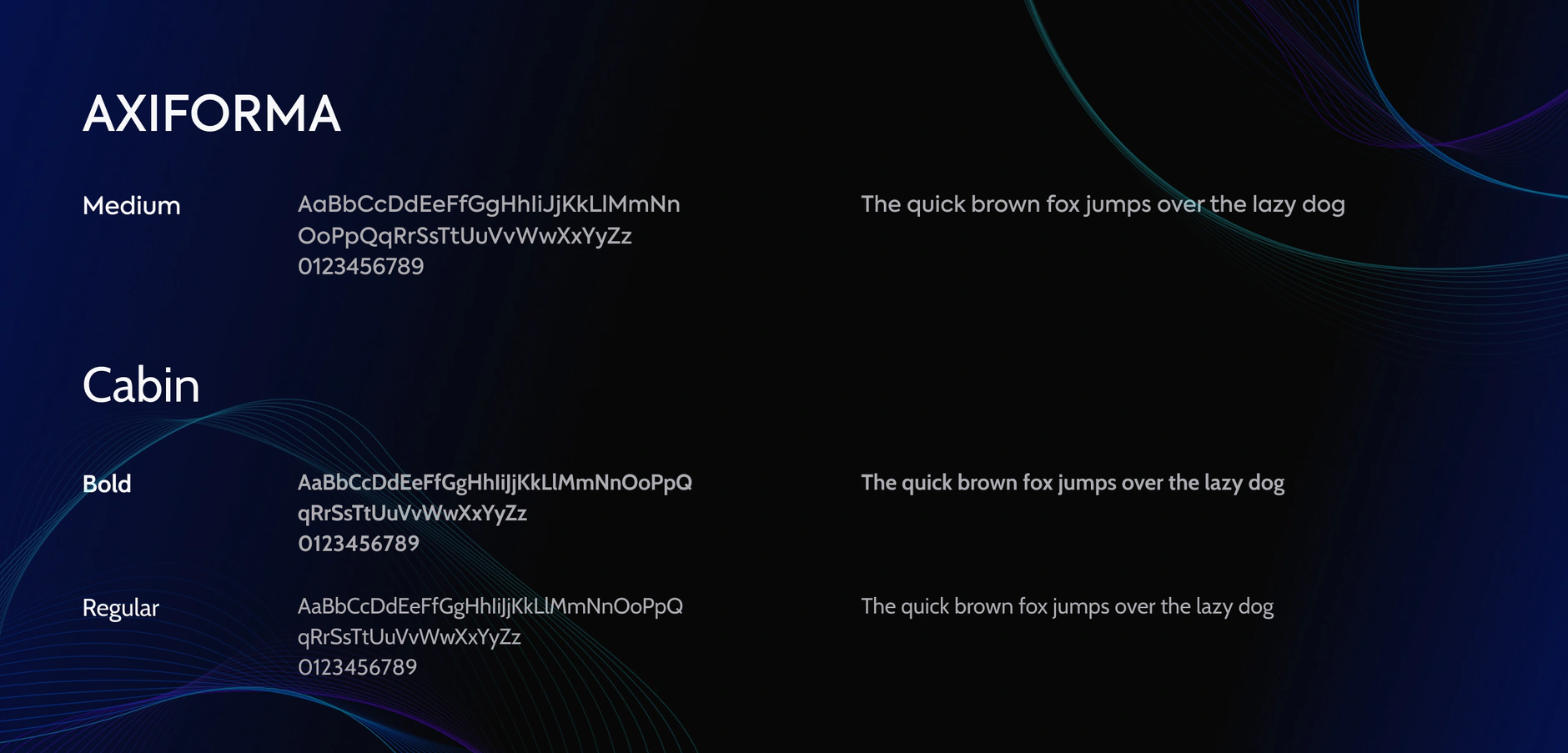
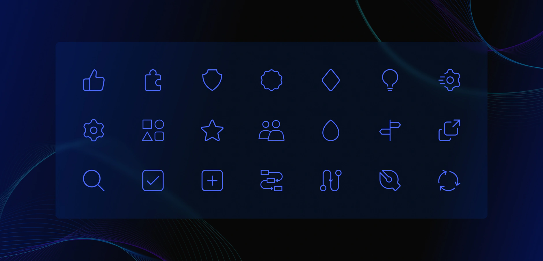
Gauss brand colour palette of seven rounded swatches with hex values, from yellow and blue to black and off-whiteGauss typography sheet showing Axiforma and Cabin type specimens with character sets and sample sentencesGauss custom icon set of twenty-one blue line icons on a dark panel, covering people, tools, search and settings

UX and Strategy

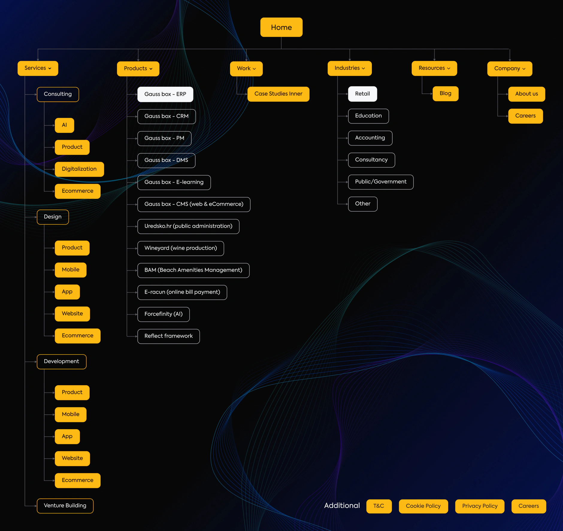
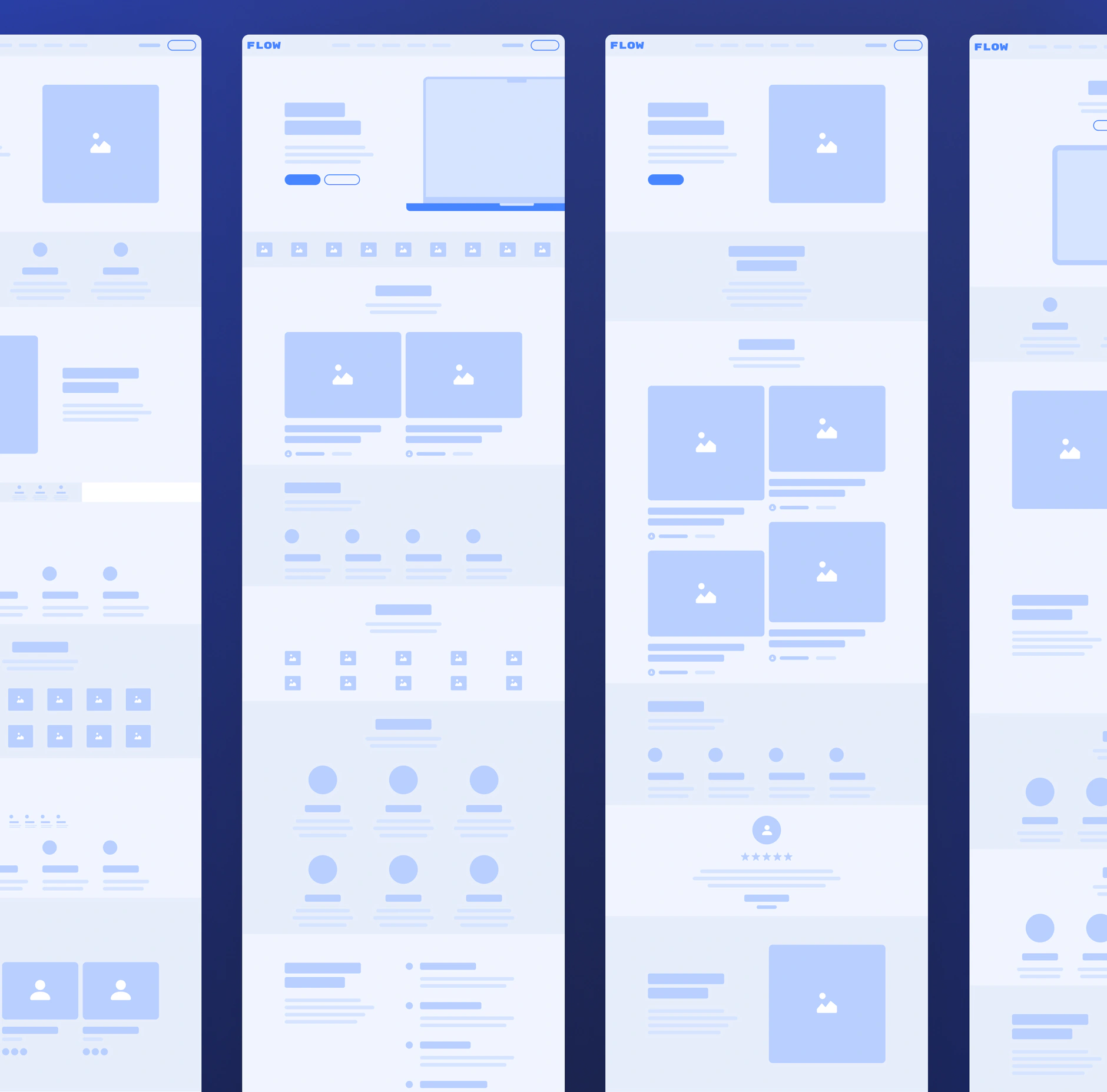
Gauss sitemap tree in yellow, branching from Home into Services, Products, Work, Industries, Resources and CompanyLow-fidelity Gauss wireframes in blue and grey, four long page layouts placed side by side

UI Design

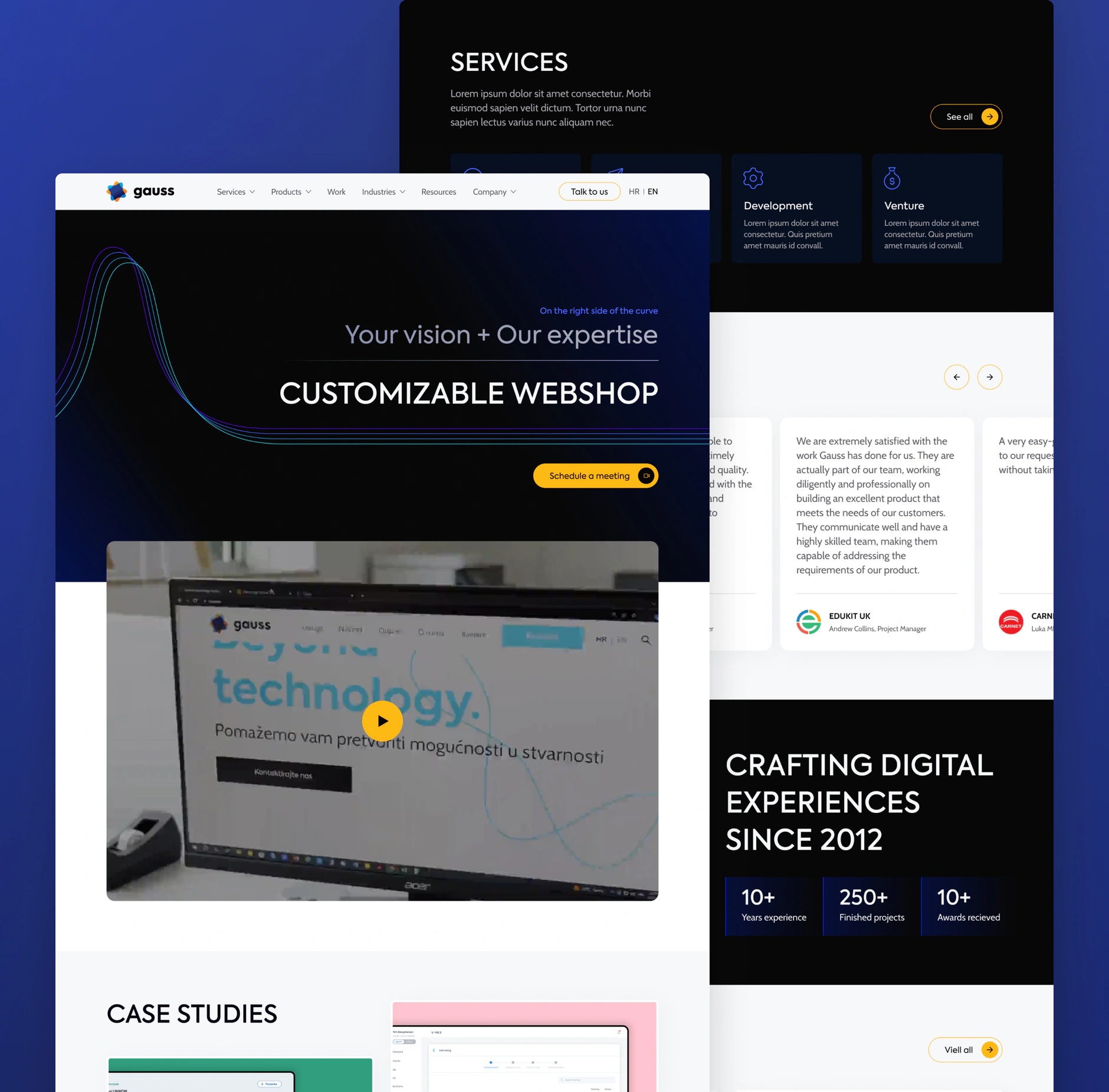
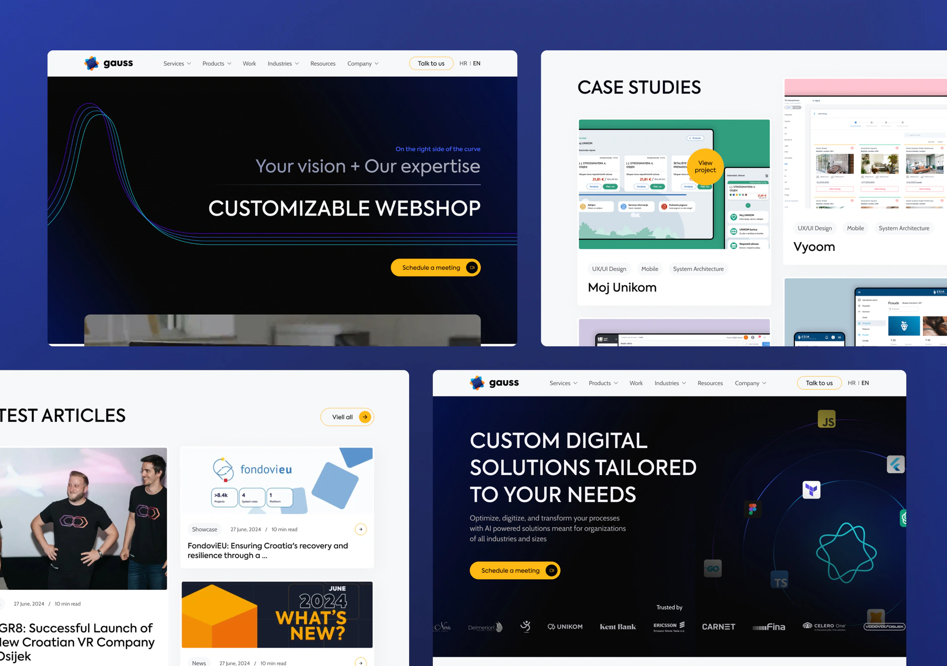
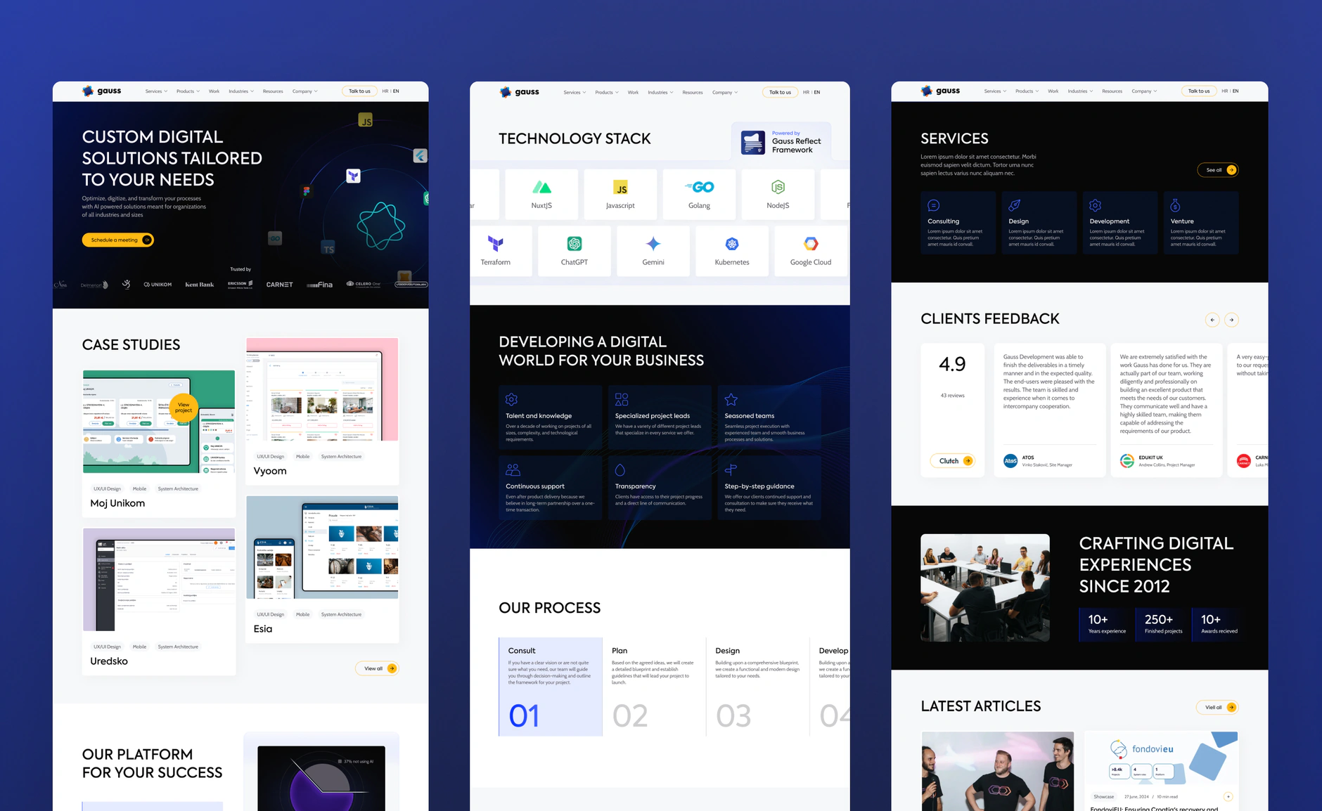
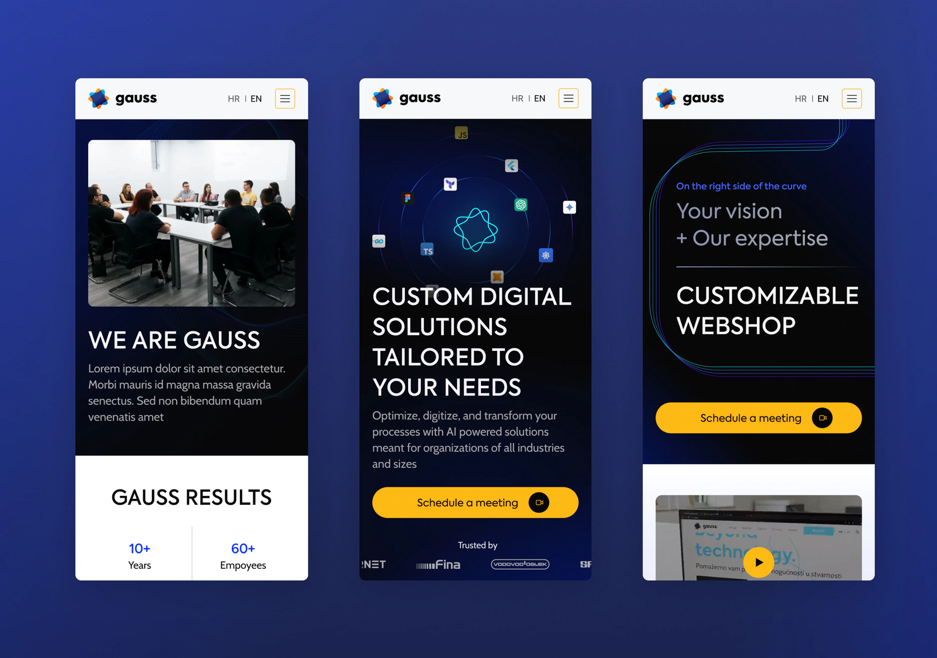
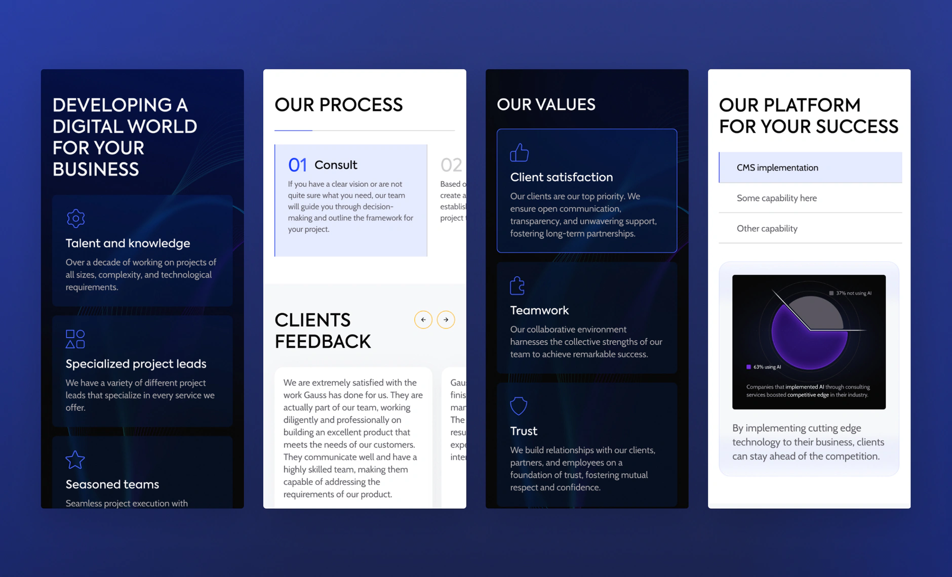
Gauss homepage UI design with the customizable webshop hero, embedded video, services cards and client testimonialsFour Gauss desktop UI sections: the homepage hero, case studies grid, latest articles feed and solutions bannerThree full-length Gauss desktop page designs covering case studies, the technology stack and client feedbackThree Gauss mobile screen designs showing the about section, solutions hero and webshop hero on a blue backgroundFour Gauss UI cards covering the services list, process steps, company values and platform section with a donut chart

Services we delivered

More work

Related case studies

View all work
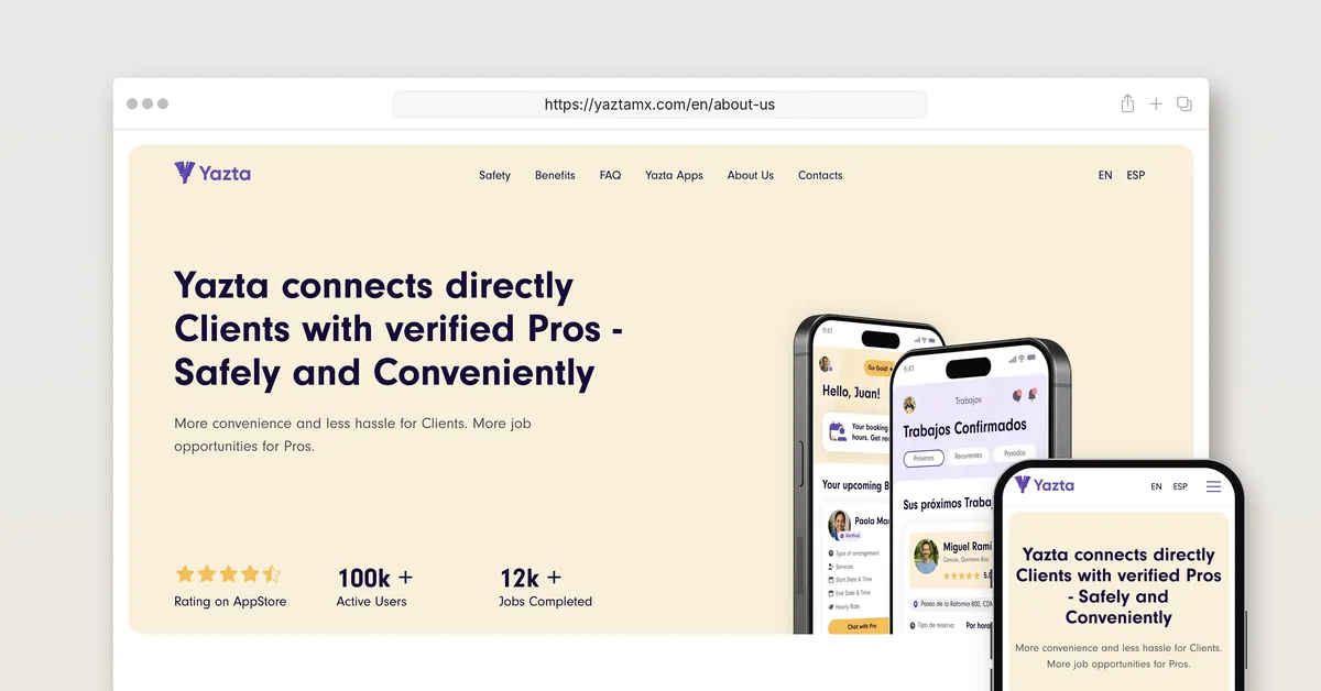
The yaztamx.com About Us page in a desktop browser and on a phone, headlined Yazta connects directly Clients with verified Pros - Safely and Conveniently

Yazta

  • Technology
  • Others

Creative Corner Studio built Yazta from a sentence: brand, two native apps, MVP in 12 months, the pre-seed deck, and a marketplace now past 90,000 users.

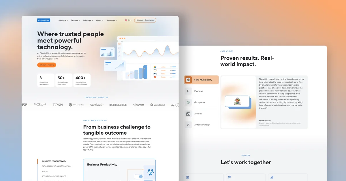
Cloud Office homepage design: the Where trusted people meet powerful technology hero beside the Proven results case studies section

Cloud Office

  • Technology

Creative Corner Studio designed and built Cloud Office's website in English, Bulgarian and Greek, launched 3 November 2025, with 292 URLs live today.

Let's talk about what your business needs next.

Whether you're planning a new website, getting more from the one you have, or improving your SEO and AEO visibility, tell us where you are. We'll come back within one business day with a clear next step.

Book a free intro call