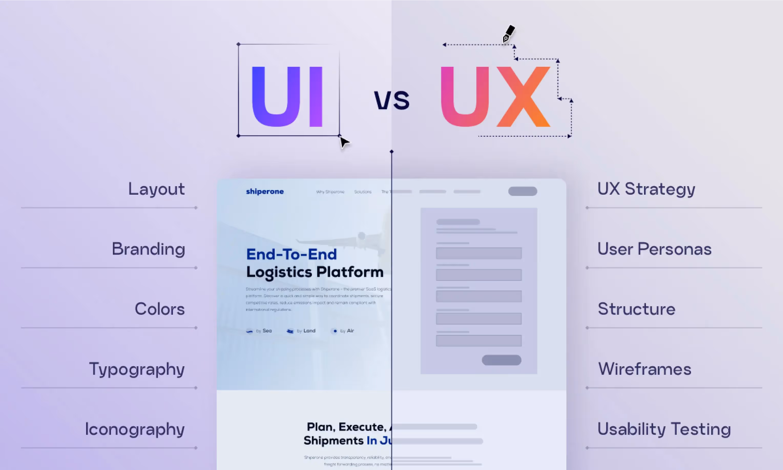
In the web design universe, the concept of user experience sits at the center, dictating whether visitors stay and explore or quickly hit the back button. This post examines UX strategies used by various platforms — some are spot-on, while others confound users like a Rubik's cube at 3 a.m.
Good UX: Tesla for its test-drive booking page flow

Imagine you're considering purchasing a Tesla. The UX starts even before you get behind the wheel. It percolates through your entire booking experience. Thanks to its intuitive and engaging approach, Tesla's test-drive booking page flow is the gold standard for turning prospects into patrons.
Why we love it?
The interface is as smooth as the ride you're about to book, with clear CTAs and user-friendly navigation that rivals the Autopilot feature itself.
Bad UX: RyanAir’s booking system
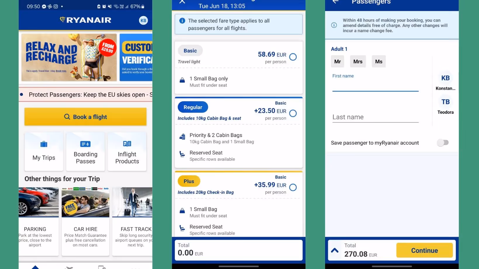
Ah, RyanAir. If flying were a video game, they'd offer the toughest level after "Very Hard". While their UX is not meant to be a joyride as they cut costs, there are cutting corners, and then there's a UX guillotine.
Why we hate it?
Picture this: You've selected a flight, nailed down the date, and even managed to agree on baggage terms with your partner, but the final checkout process is where the ship hits the fan. Hidden fees, misleading messaging, and a bombardment of offers make the flight checkout feel like you’re navigating through a budget airline bazaar. It's confusion, concealment, and chaos in what should be a clear customer conversion process.
How to fix it?
RyanAir needs to retrace its steps and ask itself if it's respecting its users' time and intelligence. A more transparent booking process with clear indicators of additional costs and a simplified checkout flow would be a good place to start.
From Bad to Good UX: Yazta
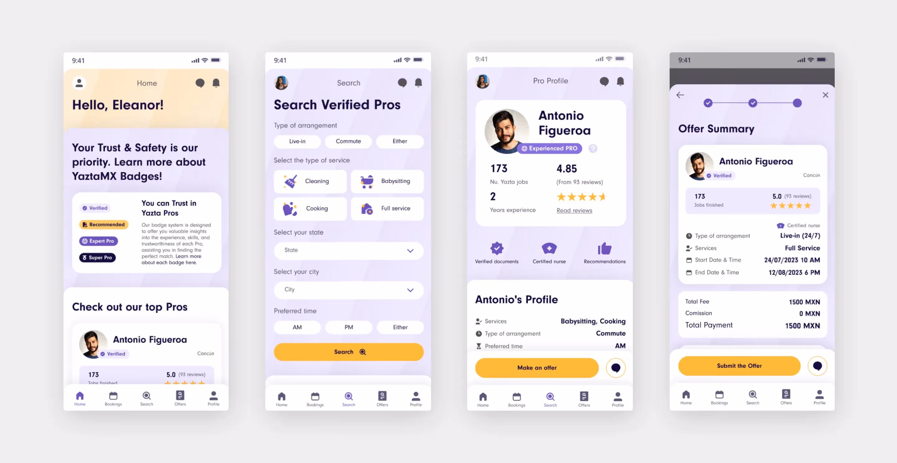
Let's be honest, sometimes "functional" just doesn't cut it. Yazta, a Mexican platform connecting home service superheroes with those in need, came to us with a classic case of this. Their app, while technically functional, felt quite confusing. We're talking labyrinthine menus and interfaces that made booking a babysitter almost feel like solving a Rubik's cube.
Why it works?
We completely revamped Yazta's UX, making it smooth and user-friendly, while simultaneously giving the UI a modern makeover that wouldn't look out of place in a design magazine. The result? An app that's not only functional but also a joy to use. Now, booking a babysitter or finding a cleaning whiz feels less like a chore and more like, well, ordering takeout – easy and satisfying.
Dive into our in-depth Yazta case study to see how we transformed a unintuitive app into a user-friendly masterpiece.
Good UX: Zoom’s user interface
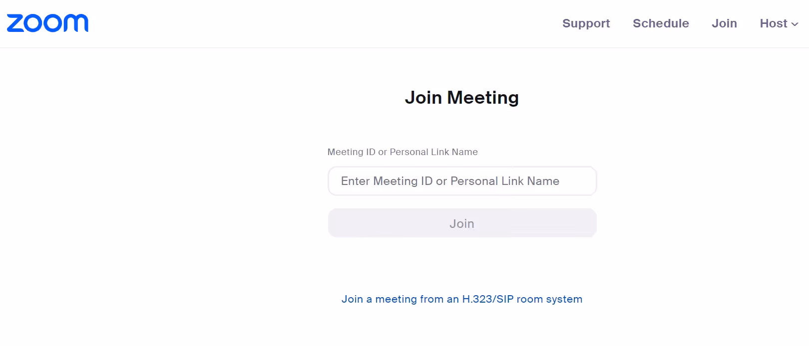
In the age of ubiquitous video conferencing, Zoom emerged as the fairy godmother of online communication, armed with a wand that emits user-centrism and ease of use like digital pixie dust.
Why we love it?
With a minimalist color scheme and uncluttered layout, Zoom’s UI understands how overwhelming video calls can be and counters that with a utilitarian, yet comforting aesthetic.
Bad UX: IMDB’s website
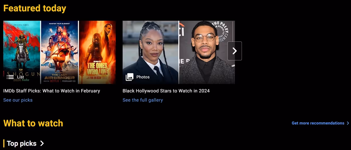
IMDB, oh IMDB. The database of dreams and mundane movie facts alike taps into the collective love for movies, yet stumbles over its own credits when it comes to user experience.
Why we hate it?
The overabundance of data points and the outdated, cluttered design turn what should be a straightforward information pursuit into an Indiana Jones-worthy quest.
How to fix it?
There's an entire university curriculum in what IMDB could do to ameliorate its UX, but here's the shortest version: Simplify the layout, make searching more intuitive with predictive text and filters, and consider a more dynamic, mobile-first design approach.
From Bad to Good UX: eBay’s mobile makeover
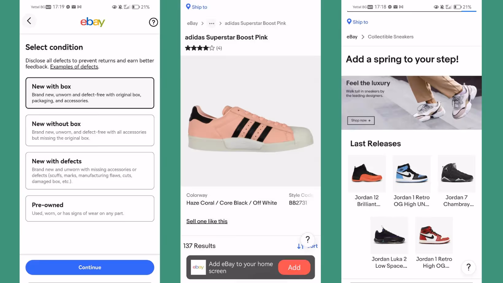
eBay's mobile app once resembled a digital flea market, with each feature shouting for your attention, leading to a cacophony of customer confusion.
Why it works?
eBay's mobile makeover illustrates the power of understanding your user behavior. With a focus on product visuals, simplified bidding, and purchase processes, the app now feels like a quintessential eBay — without the mess. The mantra seems to be "less is more", and in eBay's case, it equates to "less is significantly better”.
Good UX: Glovo’s navigation

Glovo, the on-demand delivery superhero, knows a thing or two about getting from point A to B, and their UX navigation principles aren't any different.
Why it works?
The app is designed with the understanding that the user is not here to admire the UX but to satisfy a need quickly. Orders can be placed within seconds of opening the app. Efficient filtering options and a clear, hierarchical structure makes sure the user never has to hunt for what they need.
Bad UX: Ebay’s product details
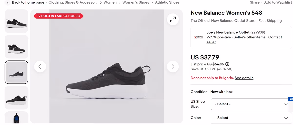
Even with its mobile app's successful redesign, eBay's website still has product details that resemble a treasure map from the Goonies—overly complicated and not meant for most human eyes.
Why we hate it?
It's hard to find essential details, and even harder to make sense of the labyrinth of offerings.
How to fix it?
eBay could glean insights from its own mobile app and consider a more condensed, clearer presentation of product details.
Good UX: Duolingo’s UX personalization
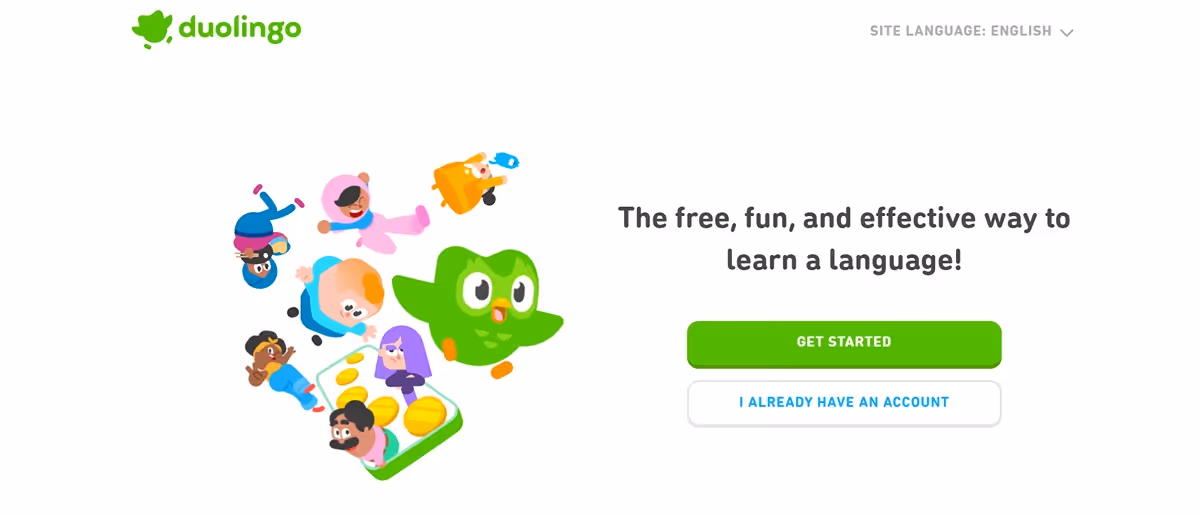
Duolingo, the language learning app, knows that engaging users in a sustained effort to pick up a new language requires a personalized touch, and it nails it with finesse.
Why we love it?
The app demonstrates the power of machine learning and user data in shaping a beneficial and personalized consumer experience. It feels tailor-made, with a UI that's as adaptable and diverse as the languages it teaches.
Bad UX: Canceling a subscription to Spotify
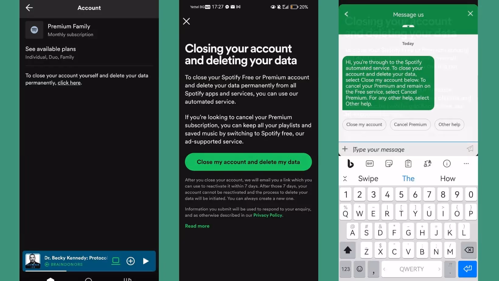
For many, Spotify is the melody to mundanity, but when it comes to canceling subscriptions, the symphony quickly devolves into a cacophony.
Why we hate it?
Canceling a subscription to Spotify could be an Olympic event in and of itself. Their user account management interface seems straightforward, but the "cancel subscription" option is buried within the "Settings" menu and then requires navigating through "Subscription options" followed by "Cancel Premium." This process also involves confirming through multiple pop-up windows offering alternative subscription plans and even a prompt to chat with a customer service representative who attempts to convince you to stay.
How to fix it?
To harmonize the cancellation process in Spotify's UX orchestra, they could simply devise a prominent "cancel subscription" button within the account settings, perhaps with a one-click confirmation. The additional offers and retention efforts could be presented separately, thereby allowing users to make a clear choice without feeling tangled in Spotify's lament of lost premium memberships.
From Bad to Good UX: Ergomotion’s Website

Ergomotion came to us wanting a website overhaul. Their old site wasn't terrible, but it lacked a certain oomph, that modern "I-need-this-in-my-life" vibe.
Why it works?
We focused on crafting a user experience that felt intuitive from the get-go. Think of it like this: you visit the Ergomotion website, and it should feel like walking into a perfectly organized showroom, not an overcrowded warehouse. Clear navigation, product highlights that make sense, and a seamless checkout process. All those little details add up, making potential customers feel like finding and buying their perfect adjustable bed is as easy (and dare we say, enjoyable?) as taking a nap.
Jump into our deep dive on the Ergomotion case study and witness how we turned an unintuitive app into a user-friendly gem.
Good UX: Nike’s selling experience
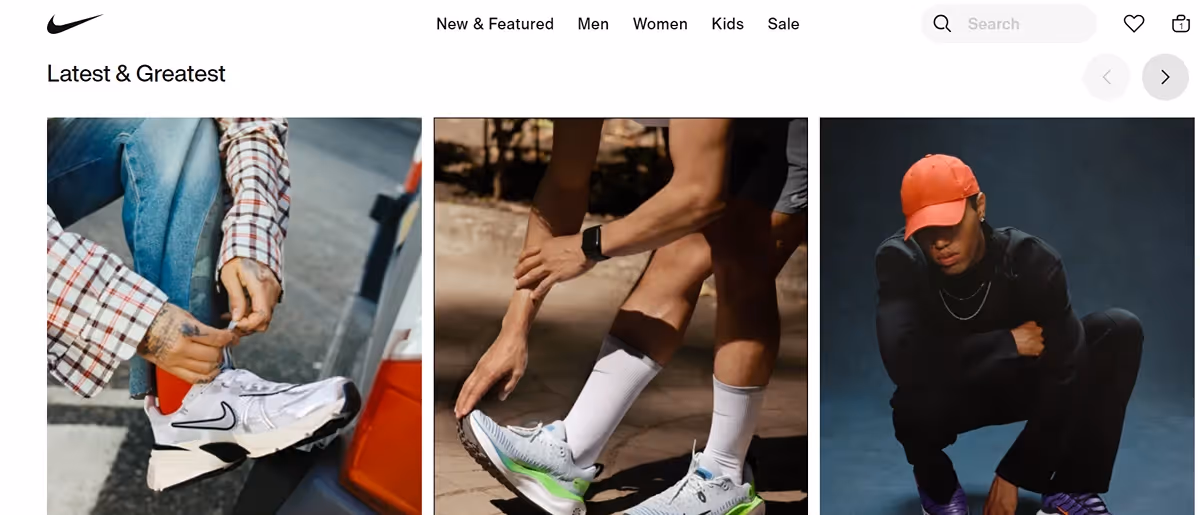
In the sporting coliseum, Nike reigns supreme, armed not just with swooshes and slogans, but also with a kingdom of exemplary UX practices.
Why we love it?
Nike's website and app are a testament to customer-centric design. Personal recommendations, virtual try-ons, and a seamless purchase process make shopping a sport in and of itself.
Bad UX: Netflix’s autoplay

Netflix's autoplay feature, at times, feels like an over-eager friend who can't wait to tell you the next story before you've even digested the last one. Once the credits of a show start rolling, this feature eagerly jumps in, counting down the seconds until it propels you into the next episode or suggests a new series.
Why we hate it?
The problem here is Netflix's love for instant gratification, sometimes nudging the story into your world with its autoplay features. When the credits roll, not everyone's looking for the energy to take on another binge-worthy narrative immediately.
How to fix it?
Clearer indicators when autoplay is about to kick in could prevent accidental marathons and allow users to enjoy the closing credits in peace.
Good UX: Google Search Landing Page
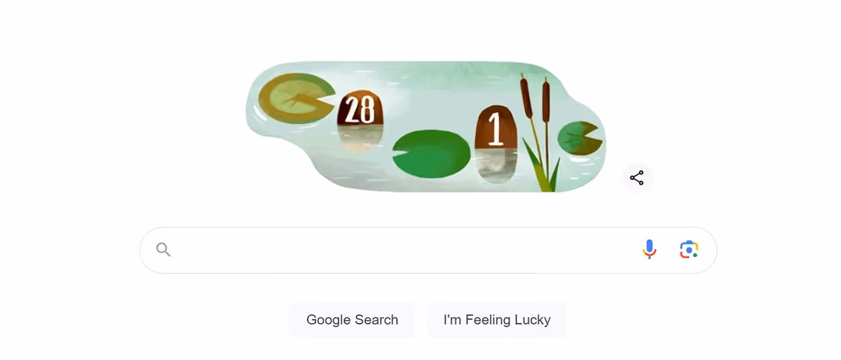
In a world where search engines could easily devolve into information battle, Google stands as a serene temple of minimalism, with white space that's almost spiritual.
Why we love it?
It's fast, familiar, and heralds the future — where the homepage is not just a hub but also a testament to a user experience done right.
Bad UX: Excessive Pre-roll Ads on YouTube
Watching videos on YouTube can be interrupted by multiple, lengthy pre-roll ads that users cannot skip, disrupting the viewing experience and leading to frustration.
Why we hate it?
The UX crime lies in the excess and the non-skippable nature of these ads. They're aggressive, antisocial, and antithetical to what should be a communal, uninterrupted experience in a platform meant to share, not shill.
Don't get us wrong, creators deserve to get paid, and we wouldn't want YouTube to turn into a free-for-all ad apocalypse. But sometimes, it feels like I'm watching more ads than actual content, especially on those shorter videos. We get that YouTube Premium is their solution for an ad-free experience, but let's be real, subscriptions can add up.
Good UX: National Geograpgic’s video website

National Geographic’s video website is like a gallery — the video player, a frame — showcasing the world's wonders with an elegance that's both educational and enthralling.
Why we love it?
It's a design that understands the sanctity of the user's encounter with content and respects it, providing a UX that's both informative and inspirational.
Final words
UX is a crucial aspect of the quality of your digital product, whether it's a website, app, or any other interactive medium. Engaging with the design community and investing in user testing and research can ensure that your UX offerings are the Tesla in the car field.
Our team at Creative Corner Web Agency - one of the best Webflow agencies out there, is always here to raise your UX game. We might be experts in the art of web design, but we are students in understanding the art of the user.
So, why wait? Ditch the confusing website and let us give your UX the makeover it deserves. Because remember, good design is like a timeless fashion staple — it never goes out of style.