


Looking for the most effective and visually striking mega menu examples to improve your website’s navigation in 2025?
You’ve landed in the right place.
Your site's menu system isn't just a feature, it's a conversion engine.
Mega menu examples from top brands prove that smart navigation design can increase user engagement by up to 300%.
A well-designed mega menu doesn’t just enhance UX, it keeps visitors engaged, boosts SEO performance, and makes large volumes of content easy to access.
In this guide, we’ve curated 13 of the best mega menu examples from well-known brands and experienced web designers.
We spent many hours analyzing dozens of mega menus to handpick the standout examples that combine smart design with proven results - and bring them straight to you.
Whether you're seeking a responsive mega menu example, a clean layout, or simply need some fresh mega menu inspiration, this list covers it.
From simple dropdowns to visually rich, multi-column designs, these mega menu design examples provide practical ideas to build better navigation in 2025 and beyond.
Let’s dive in.
What is a Mega Menu?
A mega menu (or megamenu) is an advanced dropdown navigation system that displays multiple columns of content, links, and even multimedia elements—all in one expansive panel.
Unlike traditional menus that show simple text links, mega menu examples from top brands reveal rich, organized layouts designed to:
✔ Simplify complex site architectures (perfect for e-commerce, news sites, and SaaS platforms)
✔ Reduce clicks to key content with intuitive category grouping
✔ Boost engagement through visual storytelling (images, icons, featured products)
✔ Improve mobile UX when implemented as responsive mega menu examples
Key Characteristics:
→ Multi-column structure (typically 2-5 columns)
→ Visual elements like images, icons, or CTAs
→ Responsive behavior (adapts seamlessly to all devices)
→ Keyboard- and screen-reader-friendly (when properly coded)
That’s why modern web design experts often recommend mega menus for websites that demand both scalability and an optimized user experience.
When Should You Use a Mega Menu?
A mega menu shines when a traditional dropdown menu simply can’t handle the depth or complexity of your site.
If your navigation feels cramped or scattered, it's time to consider upgrading.
Here are some of the most common use cases where a mega menu truly adds value:
🛍 E-Commerce Stores
Selling multiple product categories or brands? A mega menu allows shoppers to see everything at once—organized by type, department, or promotion—helping them find what they need quickly.
💼 B2B & Marketing Websites
If your company offers multiple solutions, industries served, or content types (like whitepapers, case studies, or pricing tiers), a mega nav can centralize it all without clutter.
📰 News & Media Platforms
For publishers with dozens of sections (sports, tech, politics, lifestyle, etc.), a mega menu keeps content accessible and encourages deeper engagement.
🏢 Large Institutions & Enterprises
Universities, banks, healthcare networks, and government sites often need to present a wide range of services, departments, or resources in a structured, user-friendly format.
📱 Any Site Needing Better UX Across Devices
Today’s responsive mega menu examples adapt smoothly across desktop, tablet, and mobile—making complex content accessible without overwhelming the user.
If your website contains a high volume of pages, categories, or services, a mega menu isn’t just helpful—it’s essential for creating a smooth, intuitive user experience.
What Are Some Best Practices in Mega Menu Design?
A well-designed mega menu can make or break your website’s user experience.
When done right, it improves navigation, reduces bounce rates, and helps users find what they’re looking for—fast.
Here are some best practices to follow when designing a mega menu that works:
✅ 1. Group Related Items Together
Organize content into clear categories and subcategories. Use headers, columns, or dividers to visually separate sections. This helps users scan and navigate with ease.
✅ 2. Keep It Simple and Scannable
Don’t overload your mega menu with too many options. Limit the number of columns (usually 2–5) and avoid nesting links too deeply. Clean layouts are easier to read—especially on larger screens.
✅ 3. Use Descriptive Labels
Instead of generic terms like "Products" or "Services," use specific labels like "Men's Footwear" or "Content Marketing Tools." This improves clarity and boosts SEO.
✅ 4. Include Visual Aids (Only When Helpful)
Icons, thumbnails, or small product images can guide the eye and add context—but only use them if they enhance the experience. Avoid clutter or unnecessary visuals.
✅ 5. Make It Responsive
A great mega menu example should look and work just as well on mobile devices. Consider stacking content, using accordion menus, or simplifying the layout for smaller screens.
✅ 6. Design for Accessibility
Use proper semantic HTML, keyboard navigation, and screen reader support to ensure everyone can access your content. This is essential for UX and compliance.
✅ 7. Keep Important Links Above the Fold
Make sure your most important pages or offers are visible without scrolling. This includes top-selling categories, login areas, or featured promotions.
✅ 8. Plan for Scalability
Design your mega menu with long-term growth in mind. As your website expands, your navigation should be able to handle new categories and pages without breaking the UI or overwhelming users.
A scalable mega menu maintains a clean, functional interface—so you can update content without sacrificing usability or design consistency.
By following these mega menu best practices, you’ll create a navigation experience that feels effortless and intuitive, while also improving site structure and SEO.
💡 Looking to improve your site’s UX even further? Explore these 22 wireframe examples to see how top designers structure websites before styling.
13 Excellent Mega Menu Examples to Inspire Your Website Navigation
In this section, we showcase top mega menu examples from a variety of websites.
These diverse use cases demonstrate how different industries leverage mega menus to improve navigation and enhance user experience.
From icons and images to multi-column layouts, these menus highlight the best strategies to simplify complex navigation and keep users engaged.
1. eBay - E-Commerce Mega Menu Example
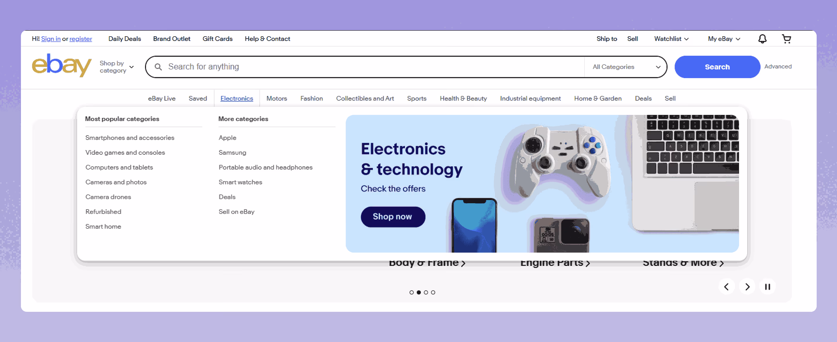
Why eBay’s Mega Menu Is a Standout Navigation System
When it comes to showcasing massive product variety without overwhelming the user, eBay’s mega menu is a model of effective UX and smart categorization.
As one of the world’s largest online marketplaces, eBay uses a streamlined, responsive mega menu to connect millions of users to thousands of categories in just a few clicks.
🔍 Key Highlights:
Category-first design: eBay’s mega menu places product categories (like Motors, Electronics, Fashion) front and center, making browsing intuitive.
Expandable submenus: Each main category opens to reveal detailed subcategories, trending deals, and personalized suggestions.
Clean layout and scannable columns: Despite the volume of content, the interface remains user-friendly and uncluttered.
Mobile-ready: The responsive menu collapses neatly on smaller screens, using icons and accordion panels to preserve usability.
This is a perfect mega menu example for large-scale eCommerce sites that need to prioritize both content depth and navigation clarity.
If you’re looking for a mega menu sample that handles high traffic, constant updates, and diverse inventory—eBay sets the standard.
Why it works:
For example, eBay’s Electronics mega menu uses a large, multi-column layout split into Most Popular Categories and More Categories.
Both sections list numerous subcategories for easy browsing.
It also features a highlighted product to attract attention and promote key items.
2. Webflow - Clean UX Mega Menu
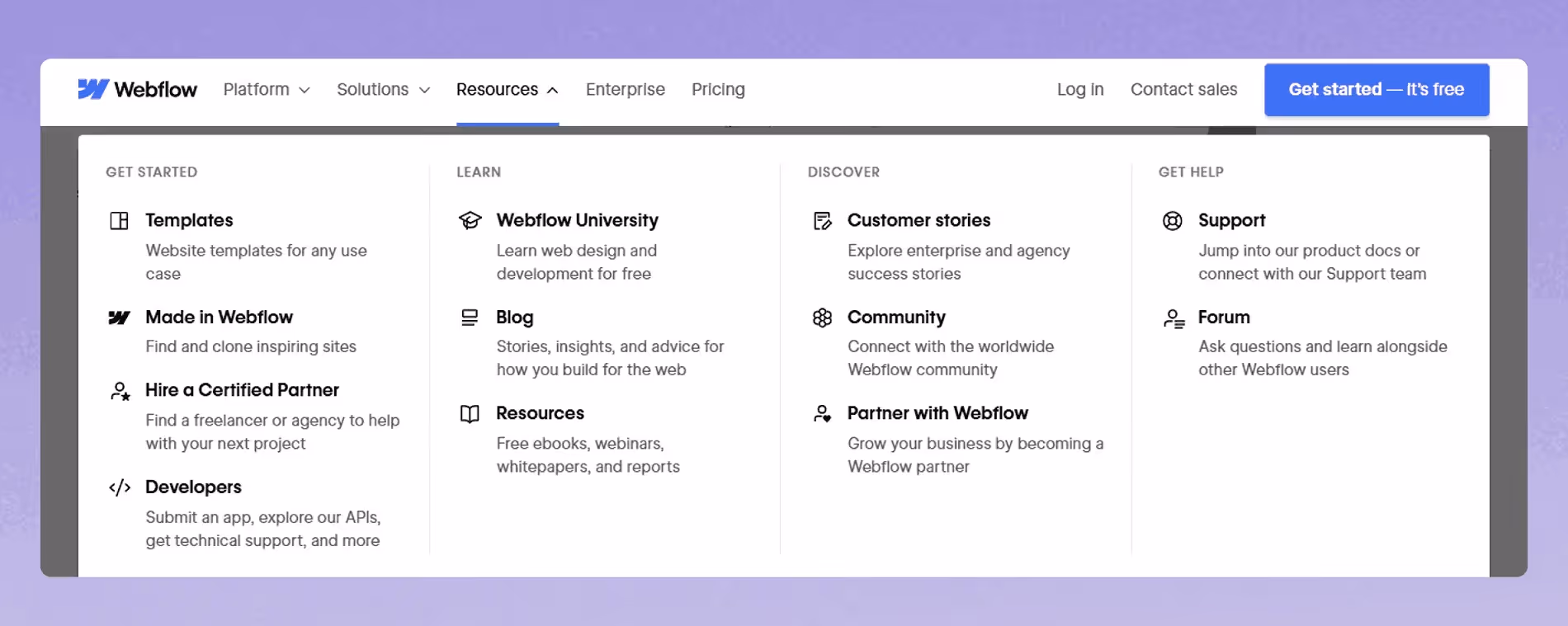
Webflow offers a standout example of a well-structured mega menu with clear separation between sections.
Intuitive icons aid quick scanning, and concise descriptions beneath certain links help users—especially newcomers—navigate confidently when faced with terms like “Webflow University” or “Made in Webflow.”
Additionally, a dedicated support area in the corner offers quick assistance for users who might need extra help, ensuring a smooth and accessible experience.
If you're exploring Webflow for the first time, check out our guide on what Webflow is and how it works to understand its full potential.
Why it works:
Webflow’s mega menu example is clean, minimal, and easy to scan—perfect for users navigating a design-focused platform.
Clear sectioning, helpful link descriptions, and intuitive grouping make it easy to find resources fast.
👉For more UI inspiration, take a look at our curated list of Webflow website examples showcasing beautiful layouts and interactions.
3. weDevs - WordPress Mega Menu Example for Product Navigation
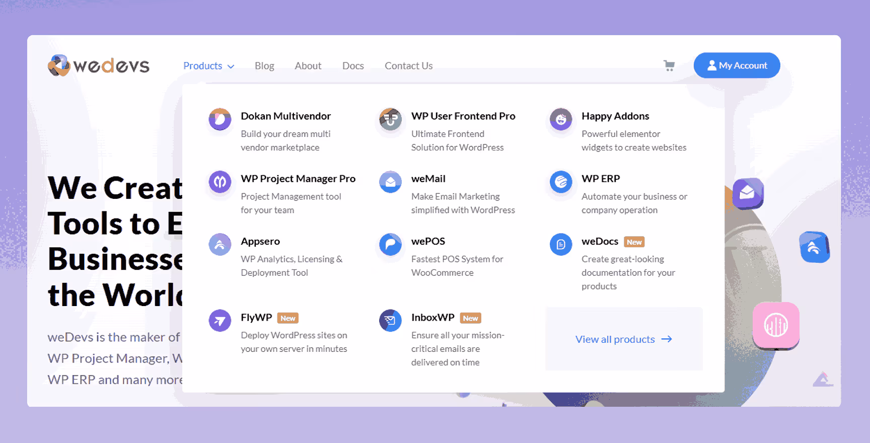
The weDevs website features a structured and user-friendly mega menu that efficiently organizes its wide range of WordPress products and resources.
It includes clear labels, clean spacing, and supportive text that helps users quickly find what they’re looking for.
Under the “Products” tab, weDevs displays several of its core offerings—each accompanied by a logo and a short tagline that highlights its purpose.
There's also a clear “View All Products” link that directs users to a dedicated product overview page.
The mega menu is fully responsive, ensuring smooth navigation across all screen sizes, from desktops to mobile devices.
Why it works:
It’s a great example of a clean, functional layout that keeps the user journey intuitive and efficient.
What makes this mega menu effective is its balance of simplicity and functionality.
4. Adidas - Clean E-Commerce Mega Menu Design Example
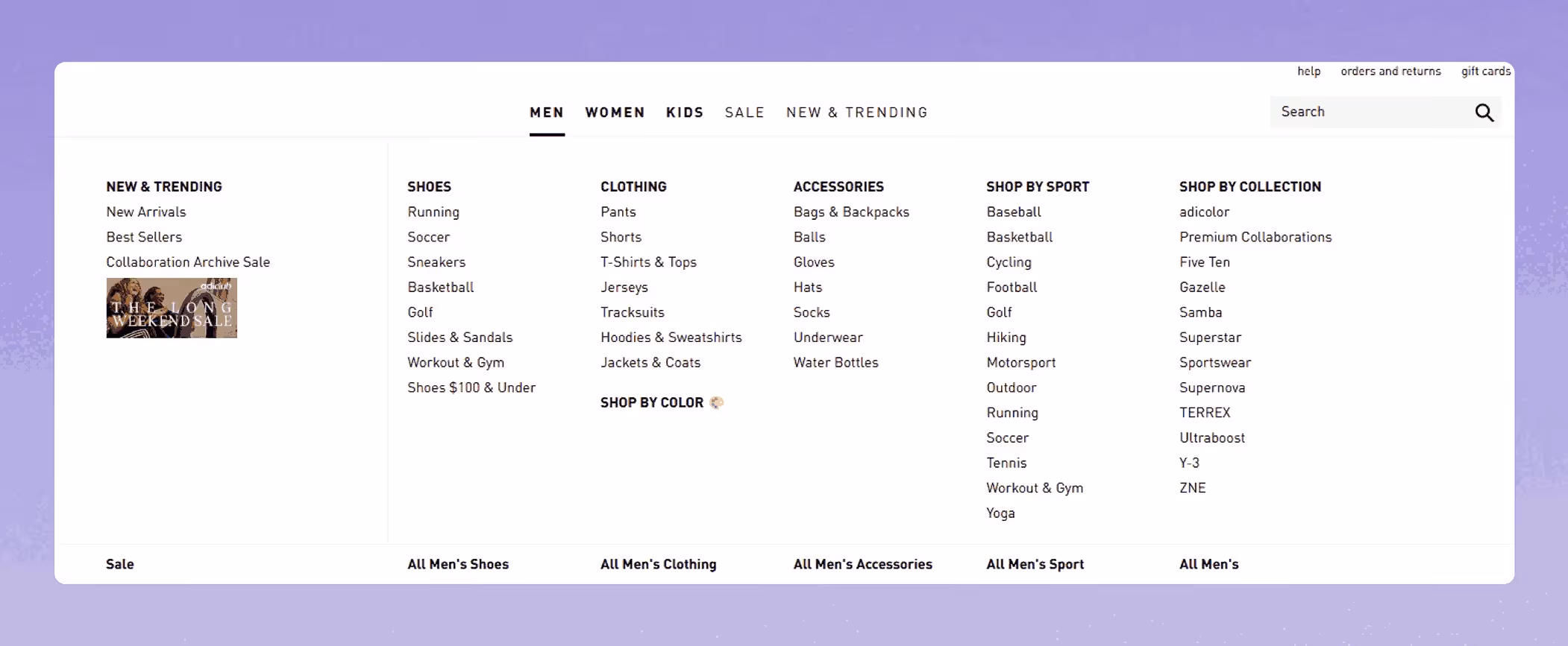
Adidas delivers a mega menu sample that’s all about clarity and efficiency. When you hover over main categories like “Men,” “Women,” or “Kids,” the menu expands into a wide, multi-column layout.
Each column organizes links by product type - such as Shoes, Clothing, or Accessories, making it easy for users to scan and navigate.
Unlike some brands, Adidas keeps its mega menu text-only, without images or thumbnails.
This approach ensures fast load times and a distraction-free experience, perfect for large e-commerce sites. The menu is fully responsive, adapting to mobile devices with a simple, touch-friendly accordion design.
Why it works:
Adidas proves that a clean, category-driven mega menu can handle a huge catalog without overwhelming users.
It’s a prime source of mega menu inspiration and one of the best mega menu examples for any modern online store aiming for high usability and conversion.
5. ASOS – Modern E-Commerce Mega Menu Example

ASOS nails the e-commerce mega menu with a dynamic, user-focused design built to handle an enormous product catalog efficiently.
This mega menu uses a clean, multi-column layout to organize thousands of products across different categories—making browsing straightforward and fast.
Key features include:
- Category-first structure: ASOS breaks down its inventory into well-defined groups and subgroups, helping shoppers quickly find items by style, brand, or trend.
- Visual cues: Subtle icons highlight sales, new arrivals, and exclusive collections, adding useful context without clutter.
- Mobile-optimized: The responsive mega menu shifts into an accordion layout on mobile devices, ensuring fast loading and easy navigation across all screen sizes.
👉Looking to replicate this efficiency on your own store? Browse our selection of the best Webflow eCommerce websites to see how top brands build high-converting shops.
Why it works:
This e-commerce mega menu sample is an excellent example of responsive design that improves engagement and sales in today’s competitive online retail market.
It’s exceptional because it lets shoppers refine their search by body fit, brand, or activity for example—offering personalized navigation that enhances the shopping experience.
If you want inspiration for creating an efficient, scalable, and visually appealing mega menu for your online store, ASOS stands out as one of the best mega menu examples.
6. IBM - Enterprise Mega Menu Design Example
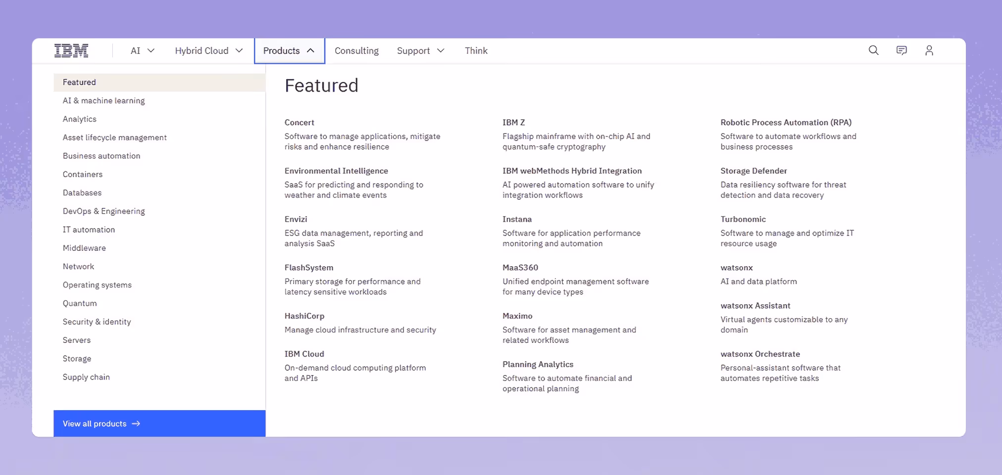
IBM’s “Products” mega menu is a textbook example of an enterprise-level navigation design.
The layout is purely text-based, no icons, no images, focusing entirely on scannability and performance. It splits into two key sections:
- Left column: High-level categories like “AI & machine learning,” “Security & identity,” and “Supply chain.”
- Right panel: Specific featured products like IBM Z, watsonx, Maximo, and FlashSystem, each with concise descriptions for fast comprehension.
The design prioritizes speed and accessibility, perfect for enterprise users who value quick access to tools and platforms over visual polish.
Why it works:
IBM’s mega menu is clear, no-frills, and structured for efficiency — ideal for navigating a broad, technical product catalog without distractions.
7. Harvard University - Mega Menu for Academic Websites
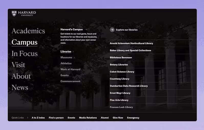
Harvard’s website uses a clean and highly readable mega menu to manage its complex content.
Under sections like “Campus,” the menu expands to show subcategories like Libraries, Museums, Athletics, and Events.
Selecting a subcategory (e.g., Libraries) opens a structured list of specific libraries across the university.
The UI design is text-only and minimalistic - no thumbnails, icons, or visual distractions—prioritizing accessibility and fast scanning.
It leverages clear headings, logical hierarchy, and plenty of breathing room between links.
Why it works:
Harvard’s mega menu handles a dense network of departments and services with clarity and calm.
It’s a model of usability for large institutions needing to present extensive information without overwhelming users.
8. Fiverr - Freelance Marketplace Mega Nav Example
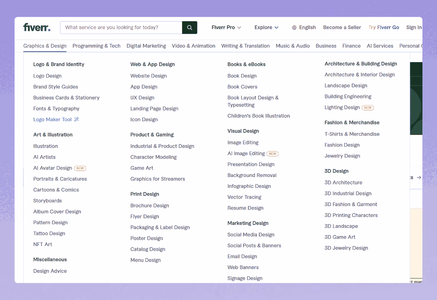
Fiverr’s mega menu, as seen when hovering over "Graphics & Design," is a prime mega menu design example for organizing a vast freelance service catalog.
It features a multi-column layout with categories like Logo & Brand Identity, Art & Illustration, and Print Design, alongside subcategories such as Logo Design and Brochure.
The menu uses clear labels and minimal icons for quick scanning, with highlighted "New" tags for fresh offerings like AI Avatar Design. On mobile, this responsive mega menu example shifts to a touch-friendly accordion layout for fluid navigation.
🔍 Key Highlights:
- Structured categories: Organizes services into scannable columns and subcategories.
- Minimal visuals: Uses subtle icons and tags to highlight new services without clutter.
- Mobile-friendly: Adapts smoothly with a collapsible design for all devices.
👉 For more examples of clever responsive behavior in modern web interfaces, check out our roundup of innovative web design examples.
Why it works:
Fiverr’s mega nav example simplifies complex navigation with a clean, category-driven layout, making it easy to find services.
Its responsive mega menu design ensures accessibility across devices, offering strong mega menu inspiration for service-based platforms.
9.Jasper - AI SaaS Mega Menu Design
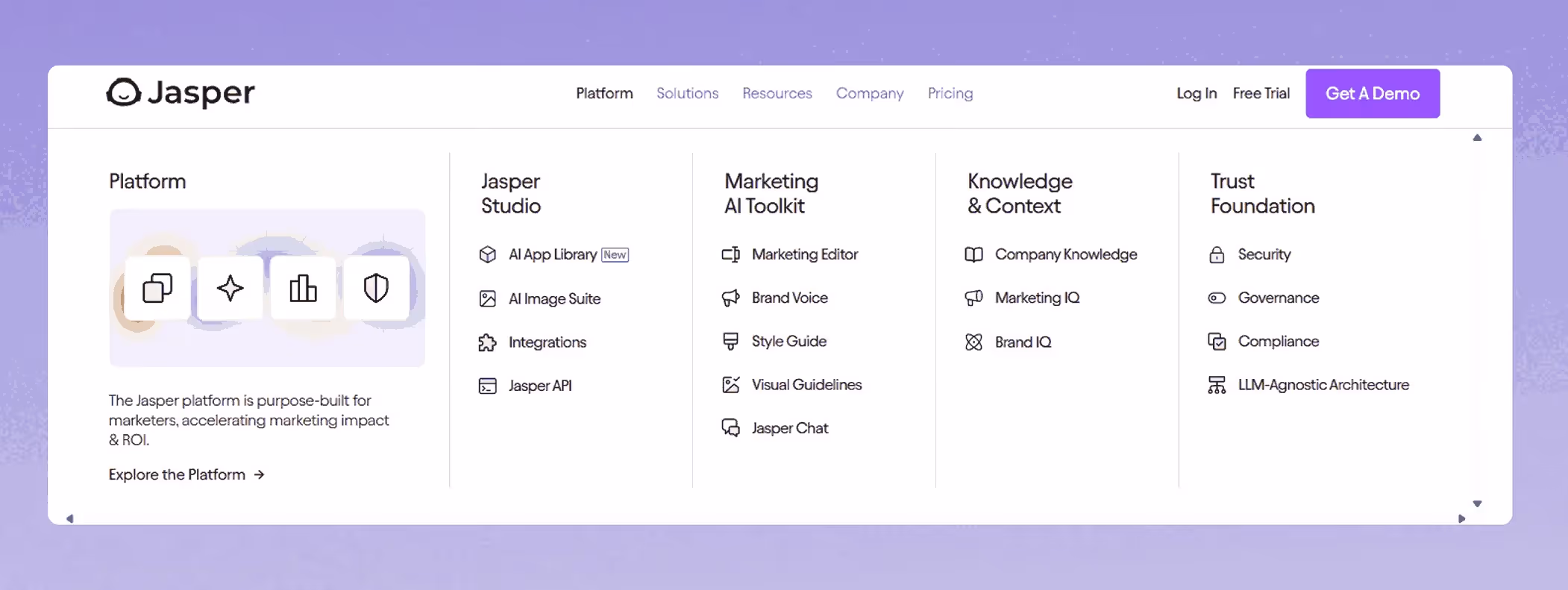
Jasper’s top mega menu design example, highlights its AI tools efficiently.
Hovering over "Platform" shows columns like Jasper Studio and Marketing AI Toolkit, with subcategories such as AI App Library and Brand Voice.
Icons and a "Explore the Platform" CTA boost engagement.
On mobile, this responsive mega menu example uses an accordion layout for smooth navigation.
🔍 Key Highlights:
- Clear sections: Columns like Jasper Studio and Trust Foundation organize tools.
- Engaging design: Icons and CTAs enhance usability.
- Mobile-ready: Collapsible layout ensures accessibility.
Why it works:
Jasper’s mega nav example simplifies AI tool access with an intuitive, responsive mega menu design, offering mega menu inspiration for SaaS platforms.
We like it because its clean layout makes complex features approachable.
10. HubSpot - SaaS Mega Menu Example

HubSpot’s mega menu is a brilliant mega menu design example, expertly organizing its marketing, sales, and service tools.
Hovering over "Products" unveils a multi-column layout with categories like Marketing Hub, Sales Hub, and Service Hub, featuring subcategories such as Email Marketing and CRM.
Clear icons and a "Get Started" CTA boost engagement, while on mobile, this responsive mega menu example adapts into a compact accordion layout for seamless navigation.
🔍 Key Highlights:
- Structured categories: Divides tools into Marketing, Sales, and Service Hub for easy access.
- User-friendly design: Icons and CTAs enhance navigation and conversions.
- Mobile-ready: Collapsible layout ensures usability across devices.
Why it works:
HubSpot’s mega nav example simplifies tool access with a clean, responsive mega menu design, offering top mega menu inspiration for SaaS platforms.
We like it because its intuitive layout and strategic CTAs make complex features highly accessible.
👉 Looking for inspiration on how to design a site that supports lead generation like HubSpot? Browse our web design projects to see how we’ve handled navigation for conversion-focused platforms.
11. HappyAddons – Creative Mega Menu Design Inspiration
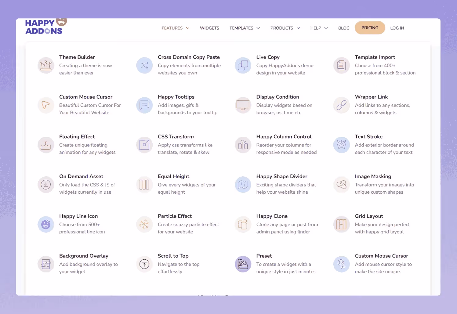
HappyAddons offers a versatile mega menu designed especially for Elementor users, blending visual creativity with user-friendly navigation.
This mega menu example uses a clean multi-column layout enhanced with intuitive icons and a concise description area to improve navigation clarity, making it easy for users to find key sections quickly.
Why it works:
HappyAddons’ mega menu sample demonstrates how design flexibility meets performance, offering a smooth way to organize complex content in an intuitive, engaging way.
It’s a perfect example of responsive mega menu design for WordPress sites built with Elementor, combining aesthetics and usability.
12. Best Buy - Responsive Mega Menu Example for Tech Retailers
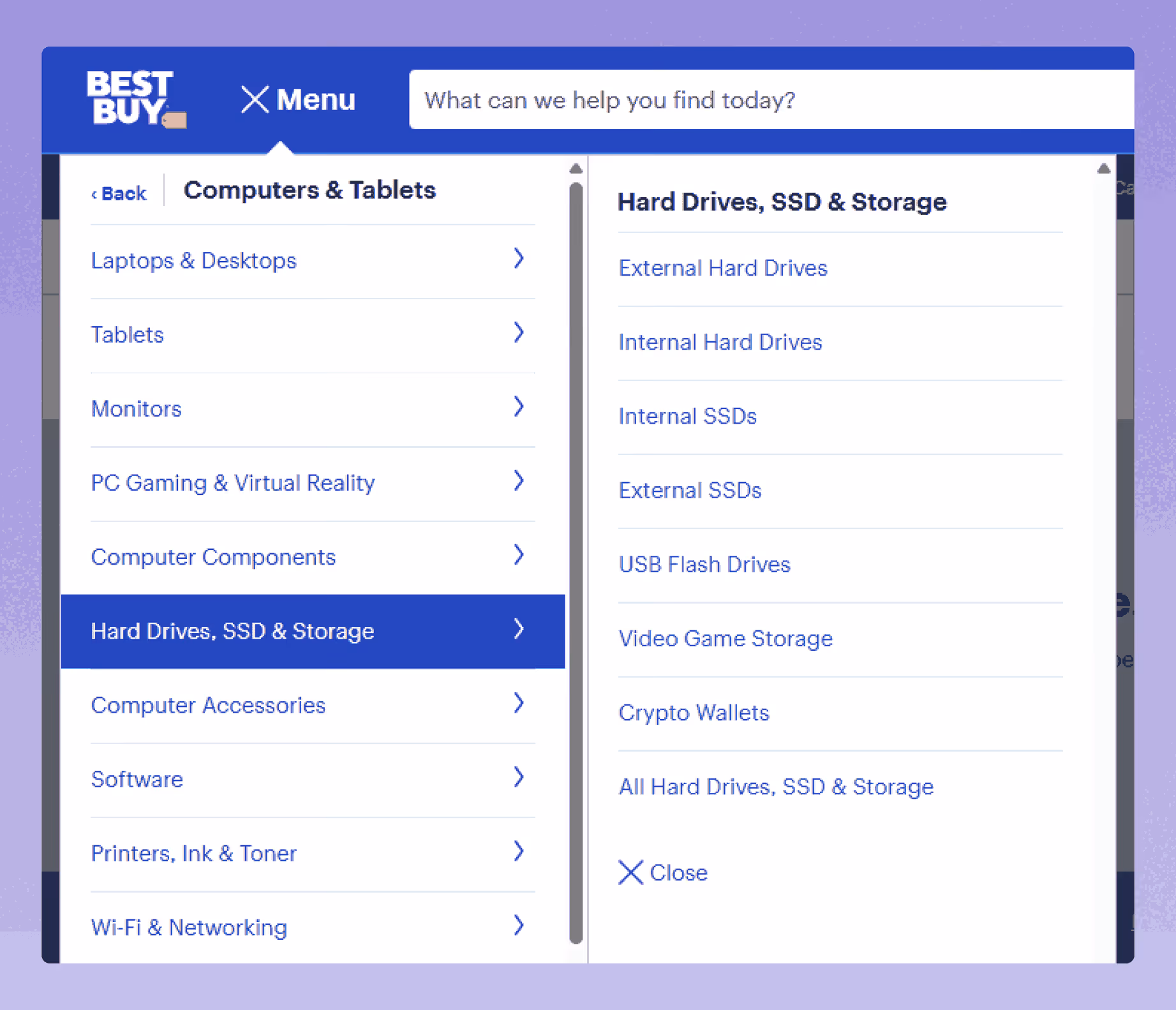
Best Buy’s mega menu offers a straightforward, multi-column layout that helps users navigate a broad selection of electronics easily.
Hovering over main categories like “TV & Home Theater,” “Computers,” or “Appliances” reveals well-organized columns grouping product types, brands, and popular deals.
The menu emphasizes text-based navigation without using icons or images, which keeps load times fast and the interface clean.
Best Buy also highlights current promotions and special offers within the menu, giving users quick access to deals right from the navigation bar.
On mobile, the menu transforms into a touch-friendly, accordion-style layout that preserves usability across devices, making it a solid example of responsive mega menu design.
Why it works:
Best Buy’s mega menu is an excellent model for retailers who want a clean, no-frills navigation system that balances usability with promotion. This example provides great inspiration for any site needing a responsive mega menu that’s efficient, easy to scan, and conversion-focused.
13. Wizz Air – Travel Mega Menu Focused on User Goals
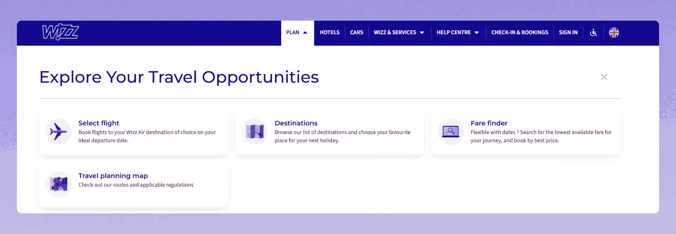
Wizz Air’s mega menu brings a fresh, engaging twist to airline navigation by combining functionality with fun.
Instead of a plain text-heavy layout, Wizz Air uses branded icons and colorful icon boxes to represent key user actions, like booking flights, checking in, or managing reservations, transforming the menu into a more interactive experience.
The design not only reflects the brand’s playful personality but also enhances usability by helping users visually recognize actions at a glance.
A notable UX touch is the clearly visible close button, allowing users to quickly exit the mega menu without confusion.
Why It Works:
Wizz Air’s mega menu succeeds because it puts user intent and clarity at the center of its design, especially important in the travel industry where users are often in a hurry.
Bonus: Mega Menu Best Practices
To design a mega menu that enhances usability and drives engagement, follow these proven best practices:
- Group related items into clear, logical categories
- Limit columns to maintain scannability (typically 2–5)
- Use descriptive, user-focused labels—not generic terms
- Prioritize top-level links and frequently visited pages
- Keep layouts clean and avoid visual overload
- Design for mobile with collapsible or accordion-style menus
- Ensure keyboard navigation and screen reader compatibility
- Place CTAs and promos strategically within the menu
- Maintain fast load times by minimizing unnecessary assets
- Plan for scalability as your content and offerings grow
Final Thoughts
A mega menu isn’t just navigation - it’s your brand’s first impression, your UX foundation, and a driver of conversion.
At Creative Corner Studio, we design mega menus that do more than look good—they guide, engage, and perform.
Because when users can find what they need fast, they stay longer and convert better.


